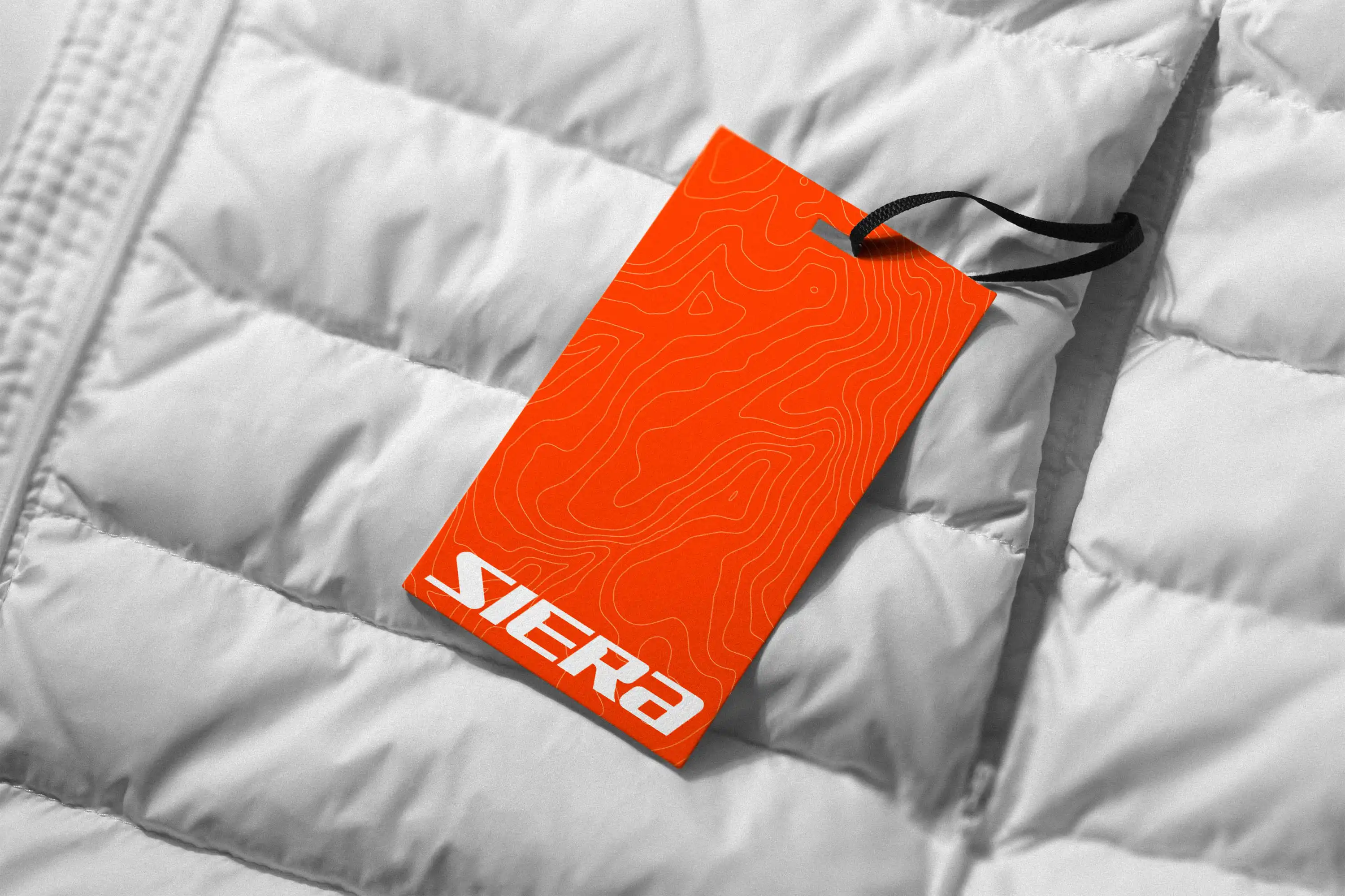
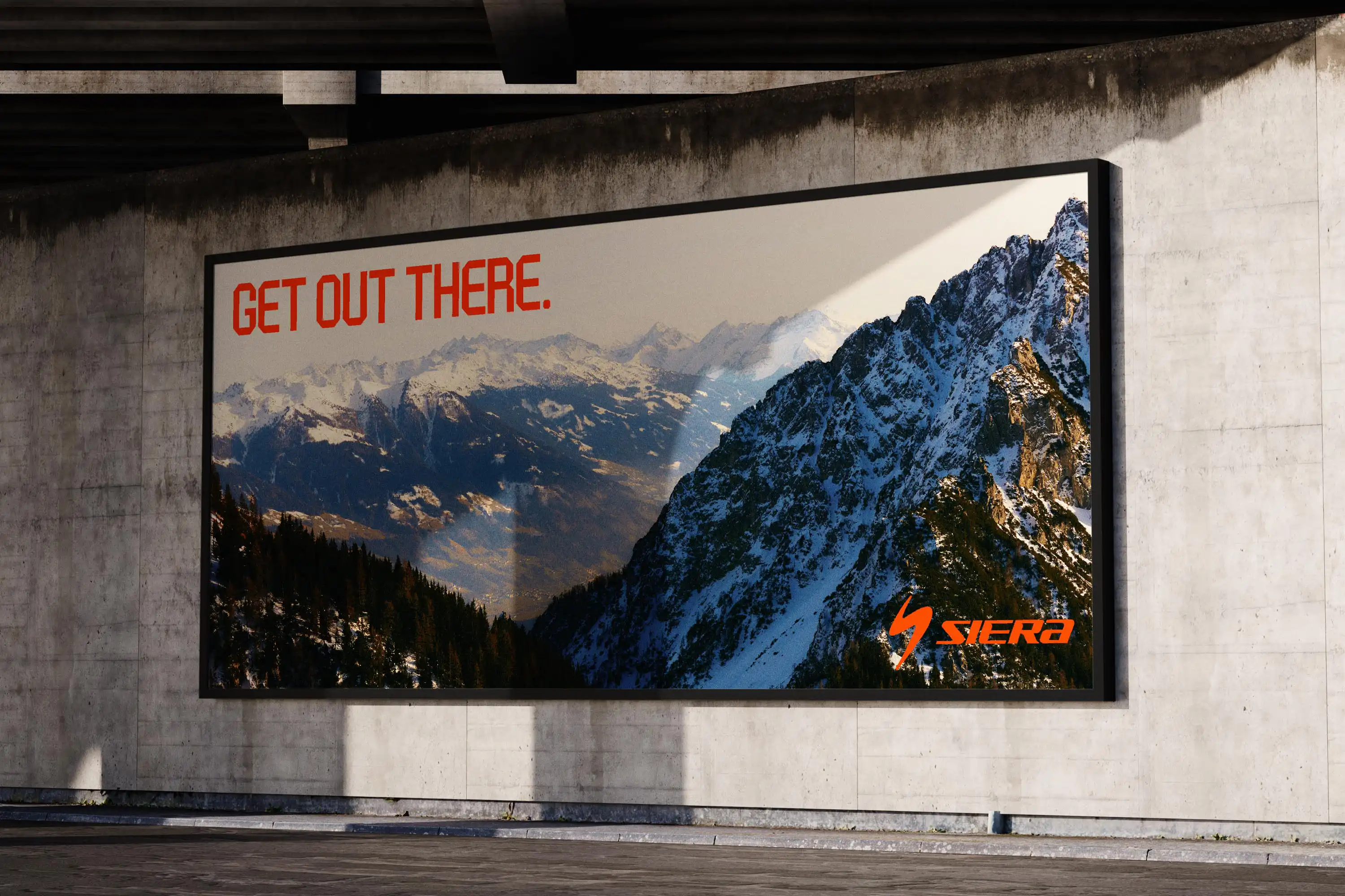
Siera is an outdoor apparel and equipment supplier. They make apparel, accessories and gear for mountaineering enthusiasts and outdoor athletes, they also have a lifestyle range for more casual consumers who love the outdoors.
They needed a logo and identity that not only shows quality and trust. But also one that was bold, daring and captures the feeling of adventure and energy that outdoor enthusiasts have.
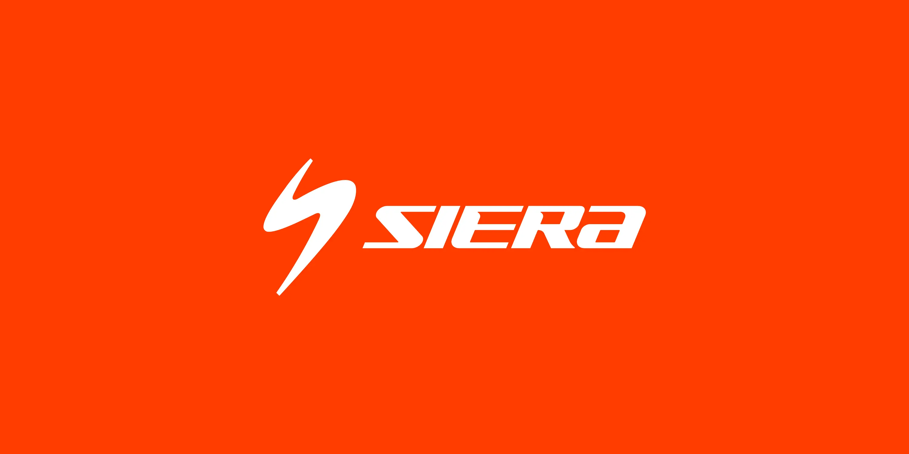
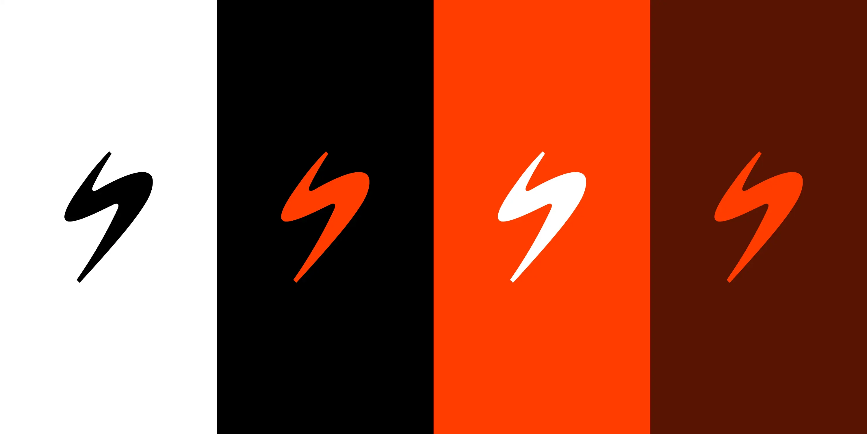
So for the logo mark we decided on a flowing S shape that looks like a river or mountain ridge. Its simplicity, slant and upward motion creates a feeling of energy and excitement.
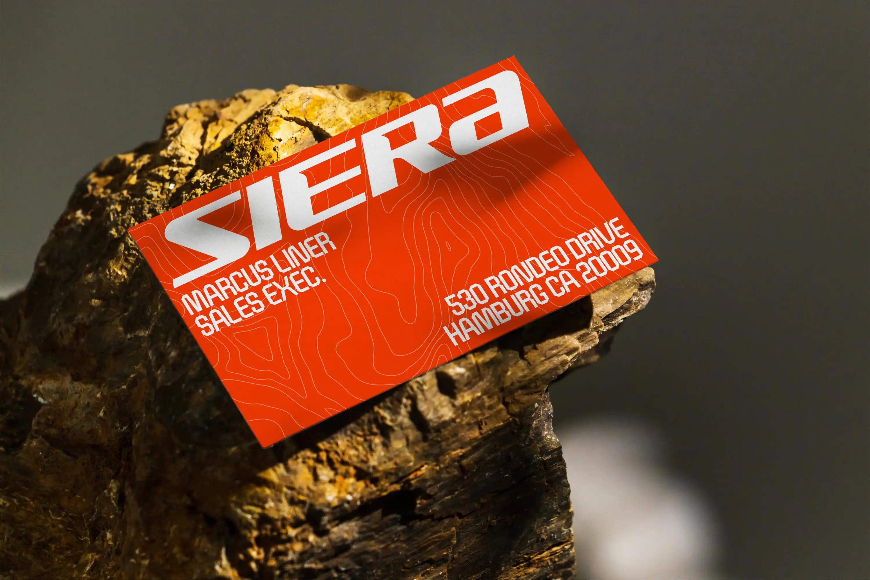
The wordmark complements the logomark with the same energetic slanted angle. Cut outs on the E and R create a sense of depth and add to the overall energy.
An electric orange as the main colour injects even more boldness and energy into the branding. Also designed to contrast with the greens, browns and blues of the outdoors, to stand out, not blend in, be bold and daring.
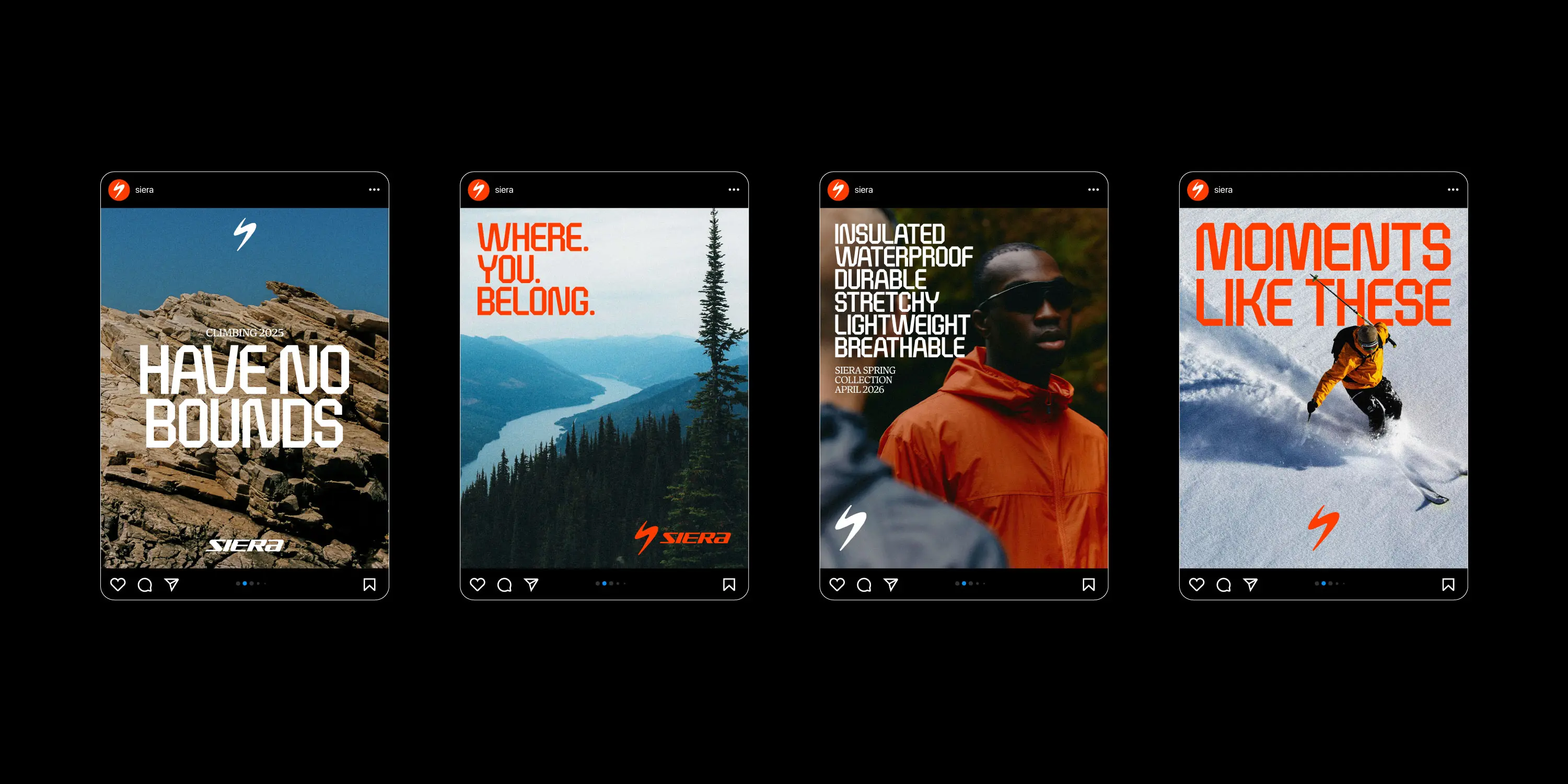
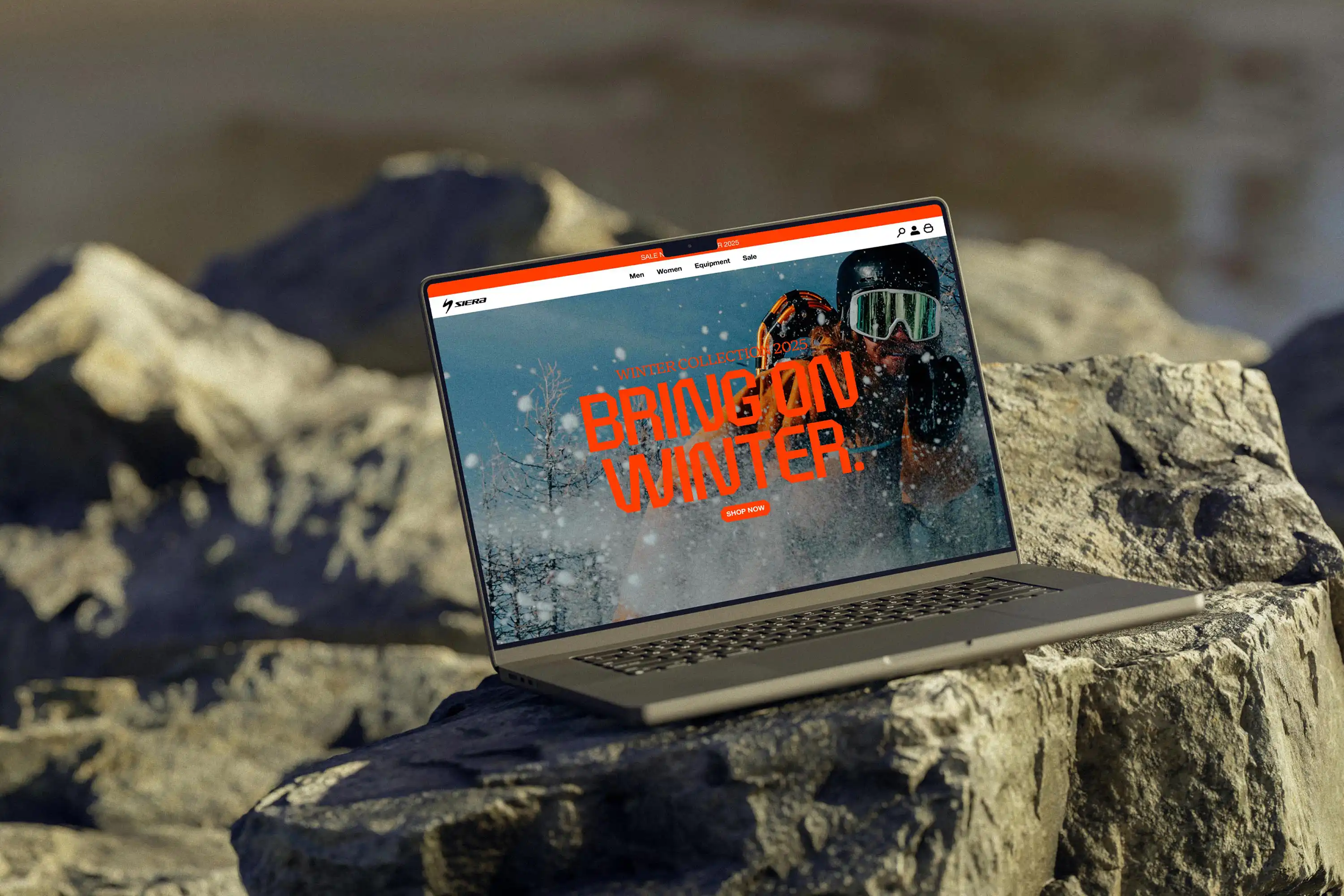
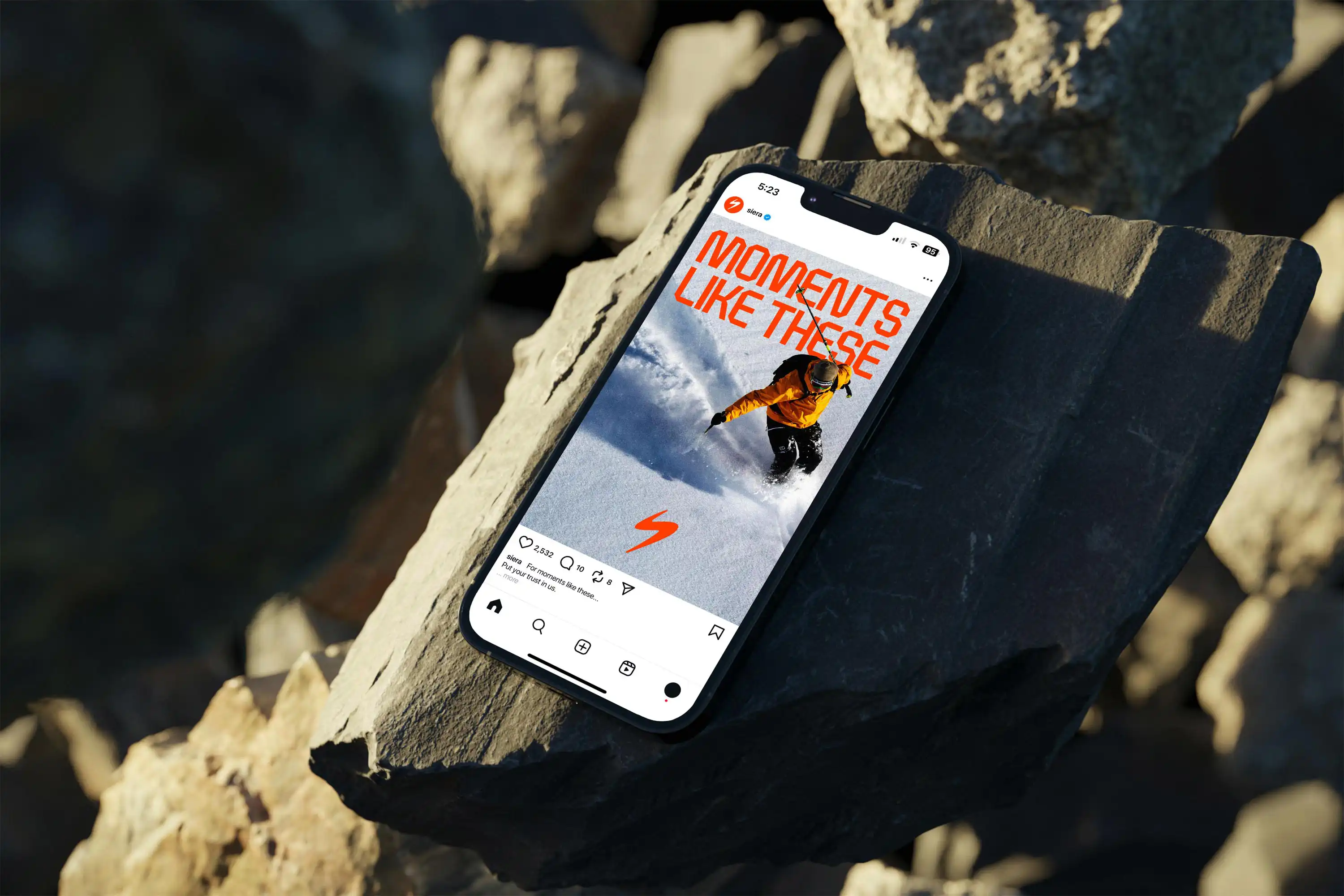
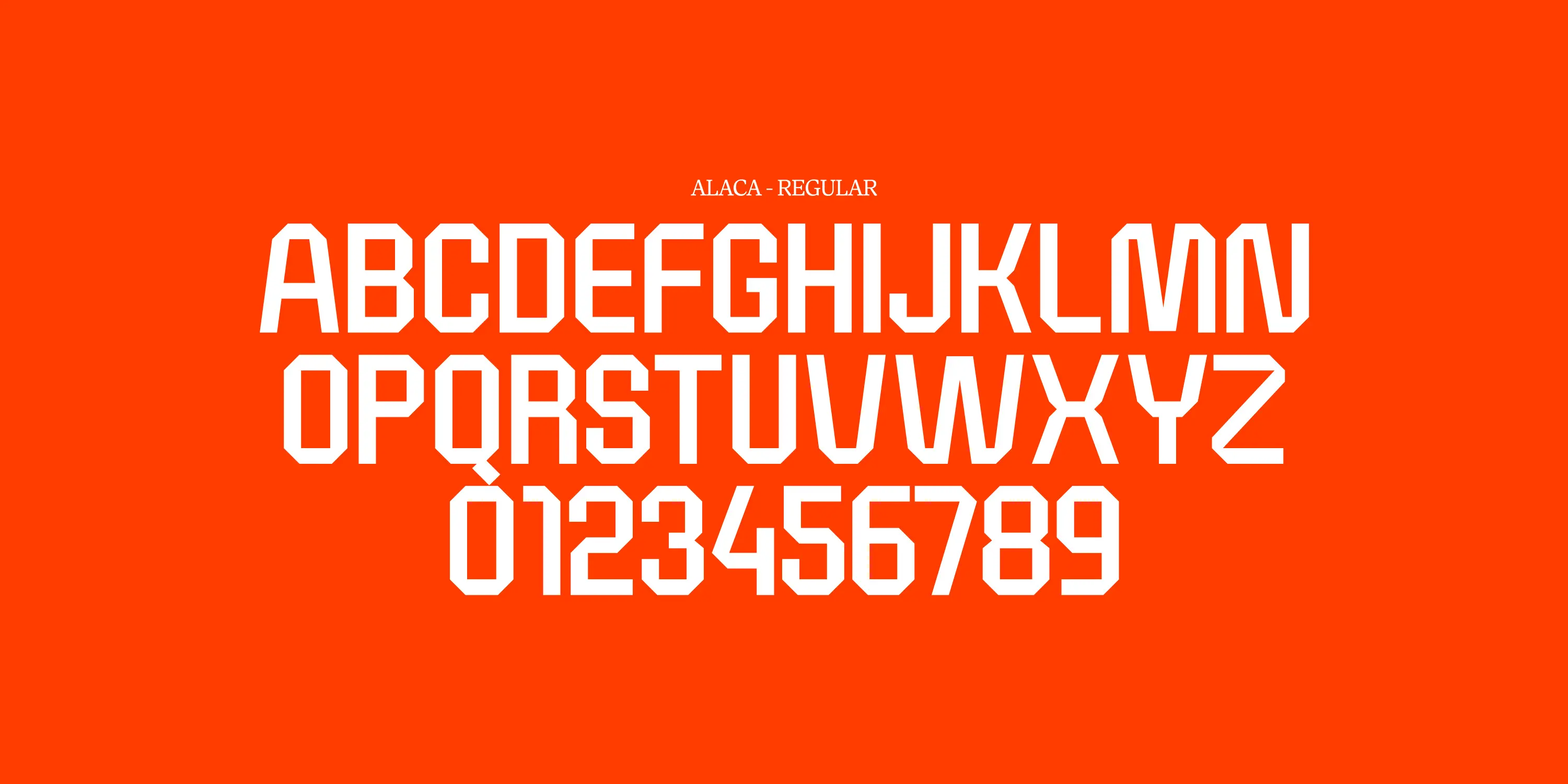

The typography system is also designed to represent the brand goals of energy, adventure and quality: For headings, Alaca is bold, daring and solid, it draws you in and creates a sense of trust with its sturdy uniform angles. For smaller headings, Antonia’s serifs offer a contrast with Alaca and have a vintage feeling, linking to old maps and adventure.
By using map topography lines as a brand asset for backgrounds another link to adventure and the outdoors is created.

