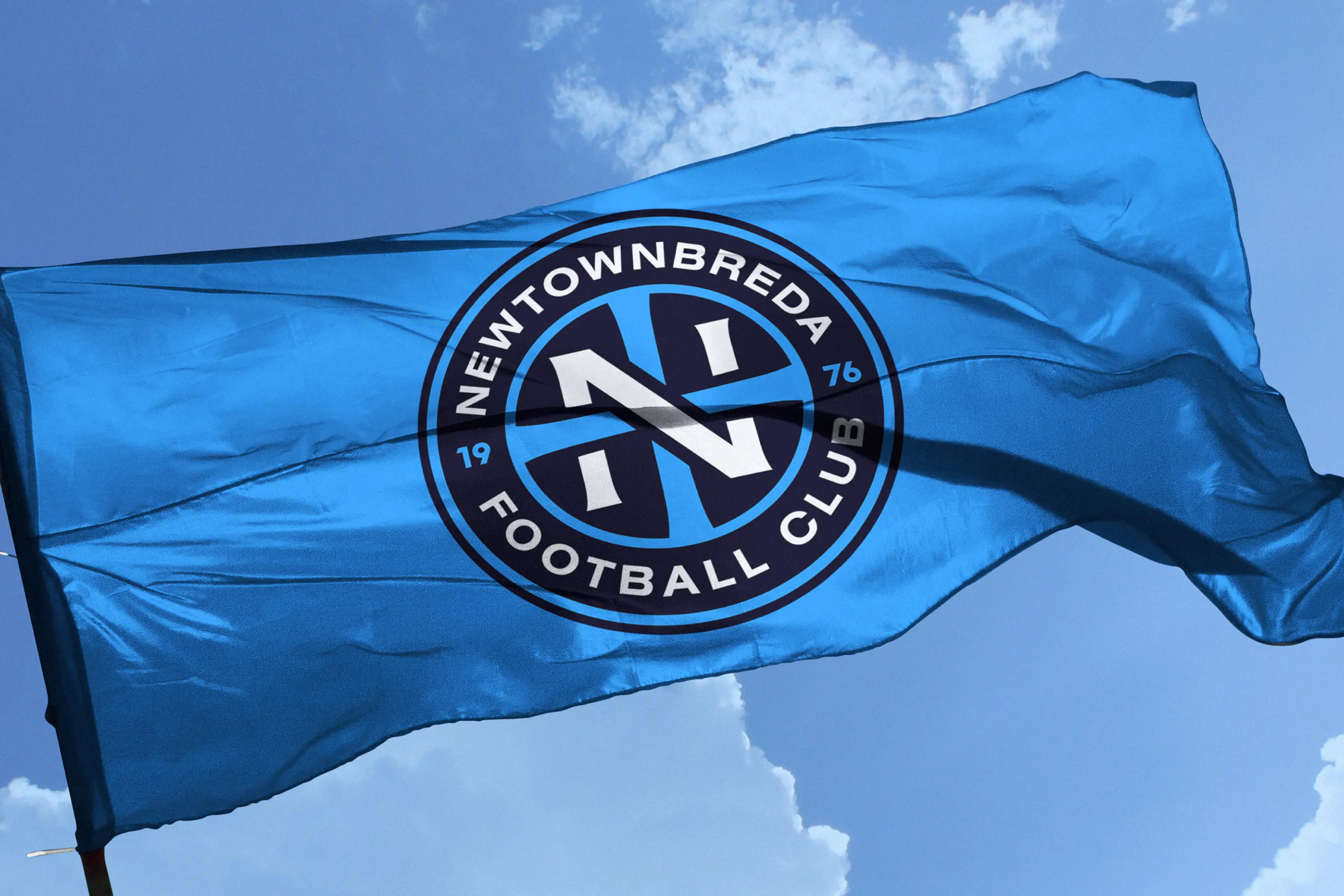
With 2026 marking the club’s 50th anniversary, and feeling that the previous badge lacked a distinct identity, the time felt right to begin a new chapter with a refreshed logo. We didn’t want to create something completely different, the aim was to preserve the spirit of the original badge while refining it into something sharper, more modern, and more meaningful, with a stronger visual impact.
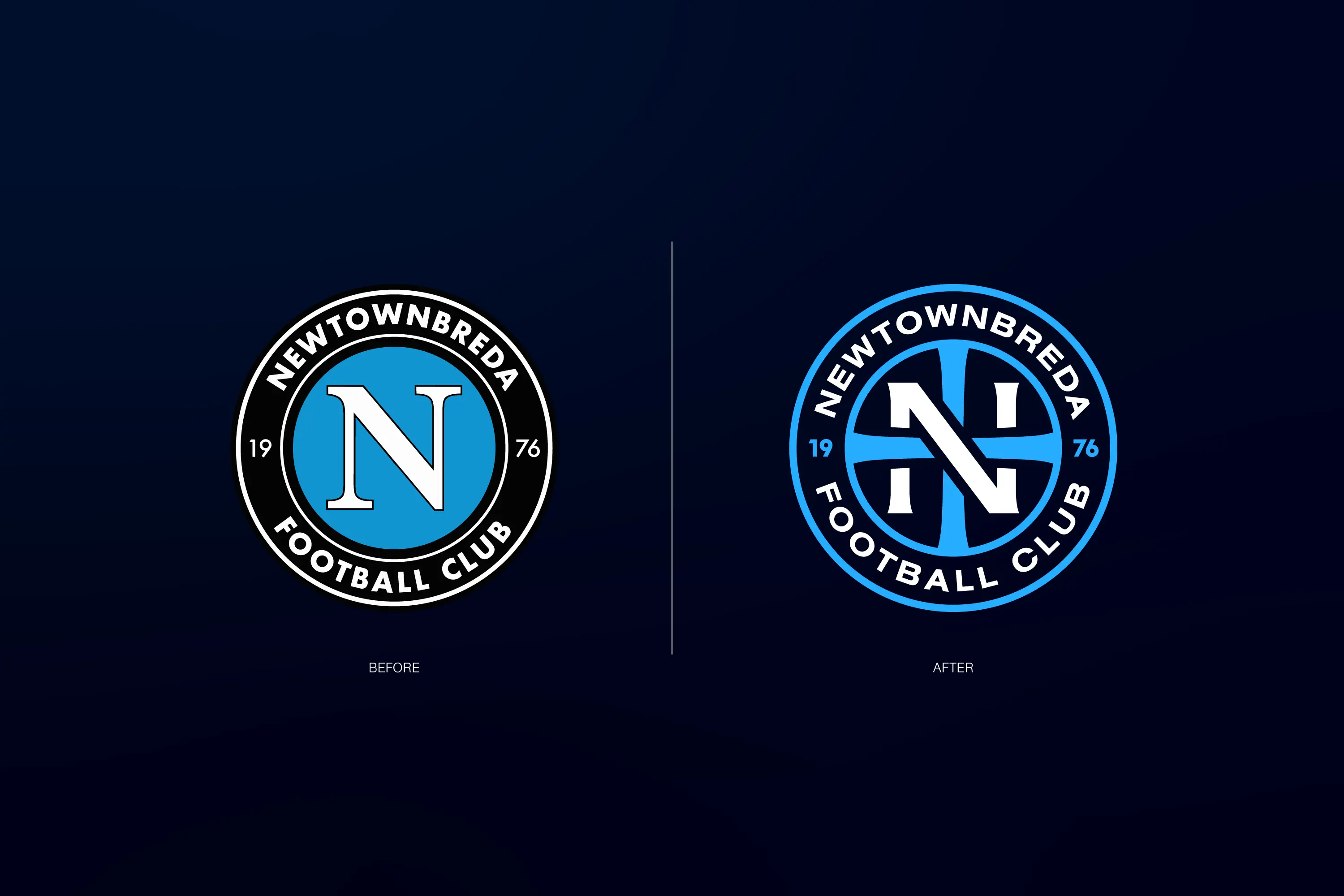
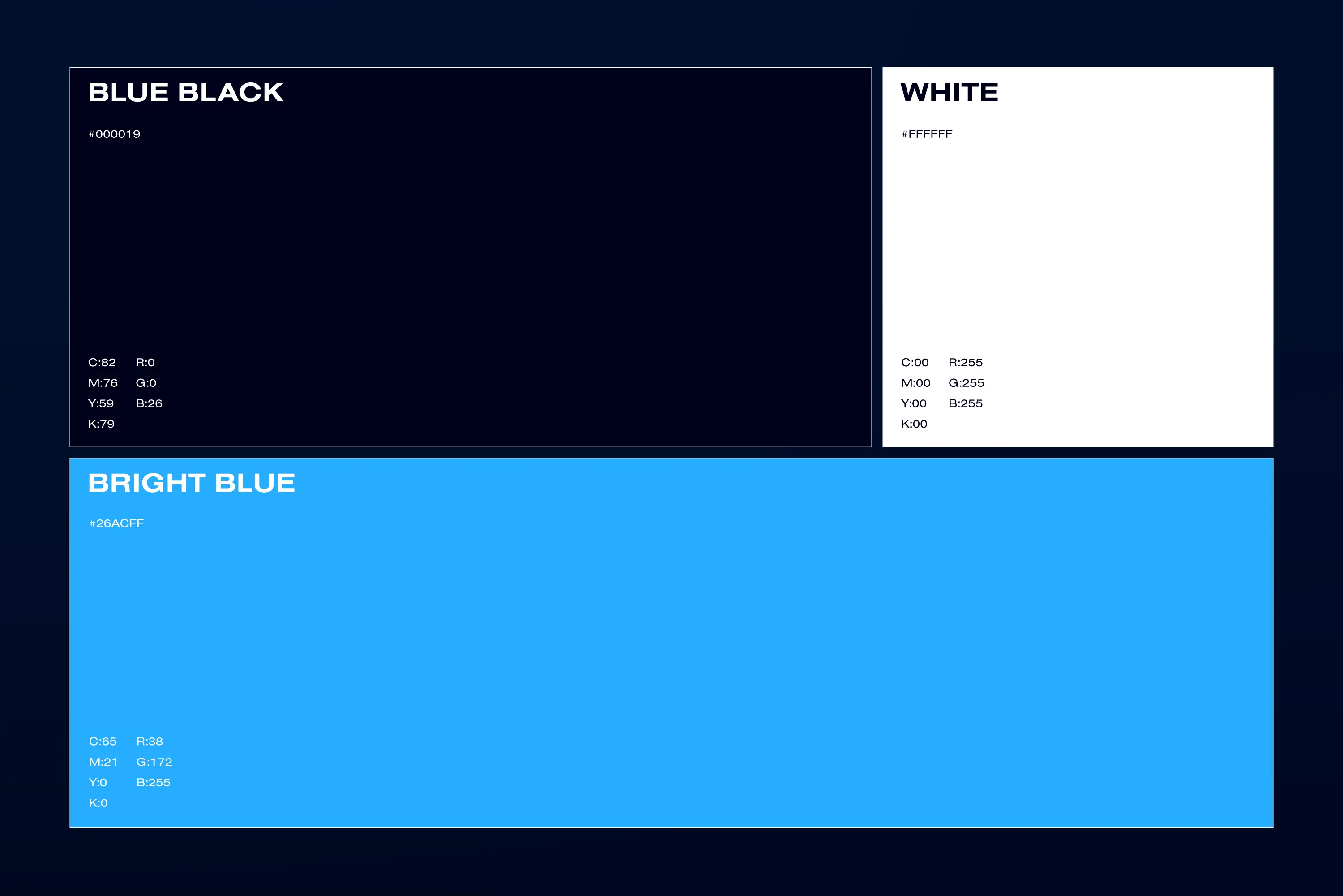
The new badge features an updated typeface, bolder colours, and stronger outlines, centered around an overlapping “N” and cross. The cross represents the club’s church roots, the Four Winds area of Belfast, and the crossroads located near the club’s grounds.
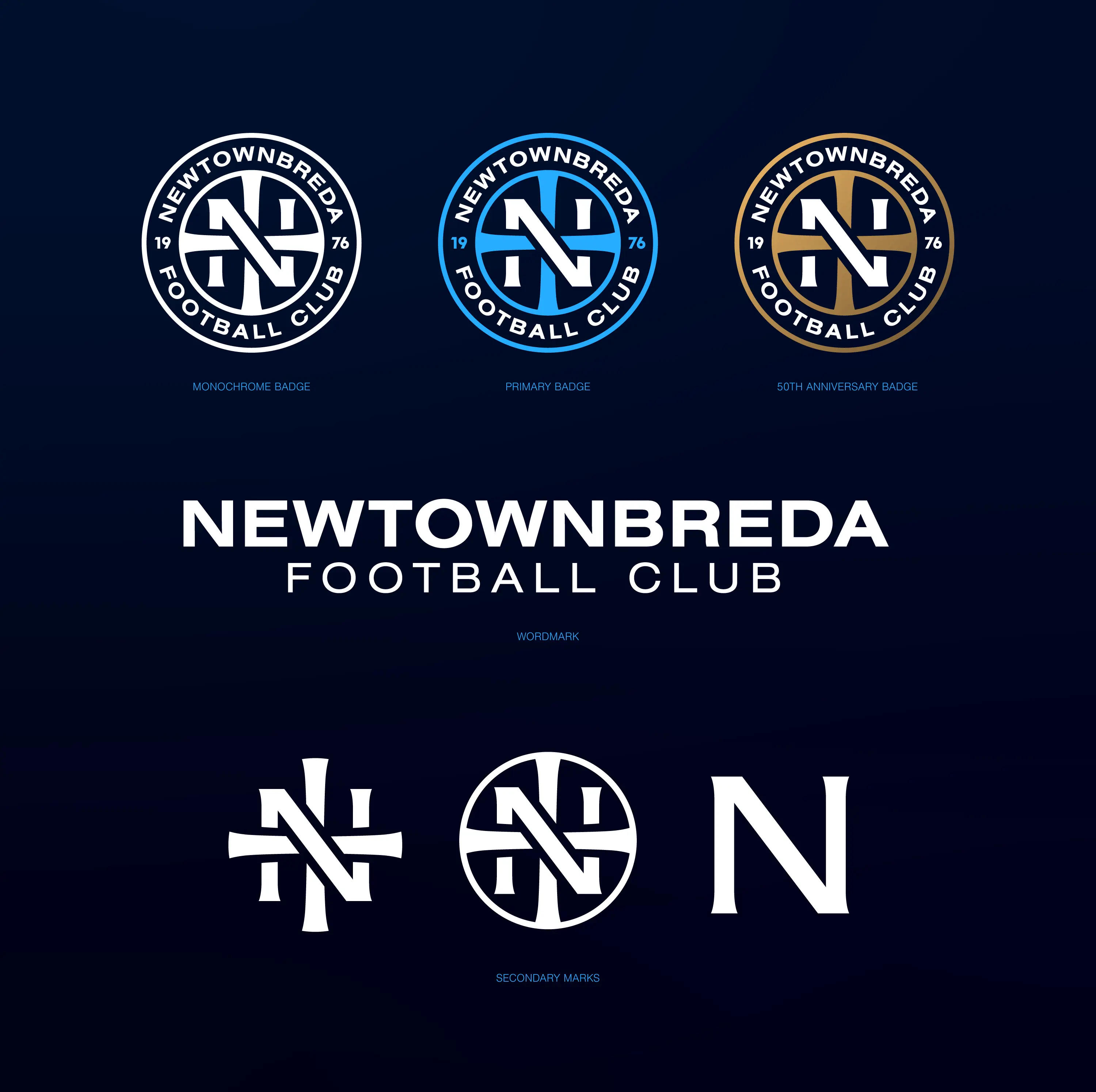
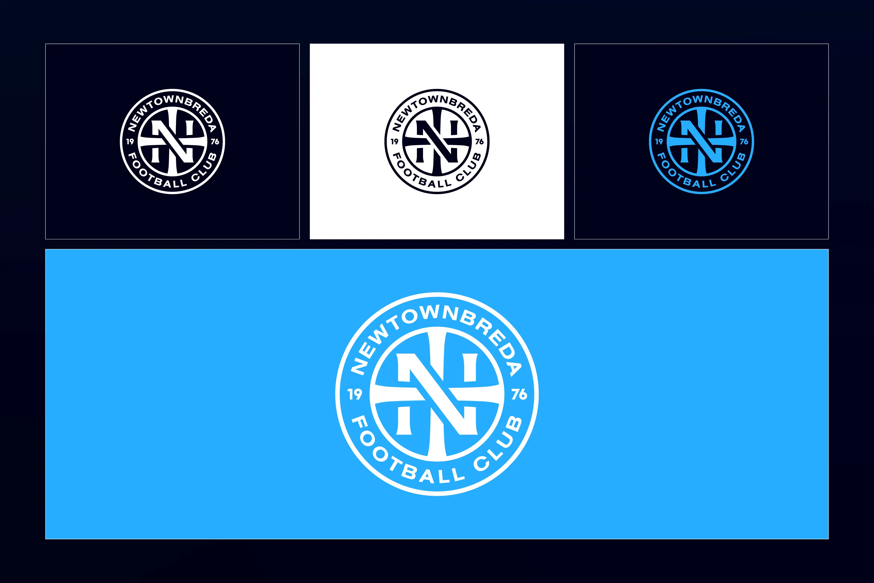
Alongside the main crest, we have also developed a range of secondary logos that can be used across the club’s wider visual identity.