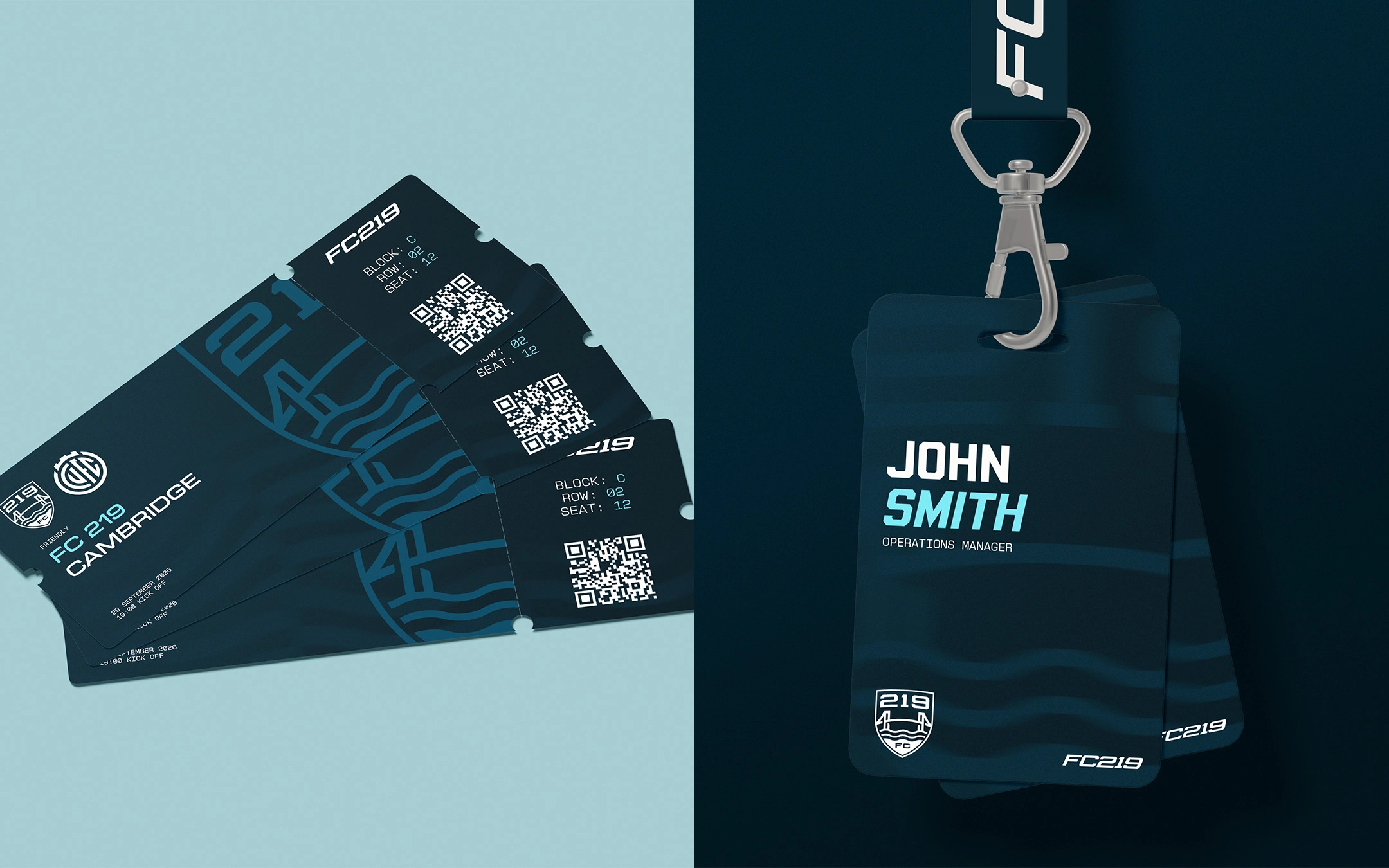
FC 219 is the first football club in England built entirely around post-eligibility American college soccer players. Rather than functioning as an academy or a gap-year experience, FC 219 is a fully FA-affiliated football club with genuine promotion ambitions.
The foundation for the club was laid in 2020 with the launch of 219 Sports, a highly personalized consultancy created to fix a US college soccer scholarship pathway that was often disorganized and reliant on chance. FC 219 acts as the centerpiece of this wider ecosystem. By blending established expertise in athlete recruitment with the recent surge of American interest in the UK football pyramid, the club possesses one of the most distinct identities in British football and is perfectly positioned to capture significant attention across the United States.
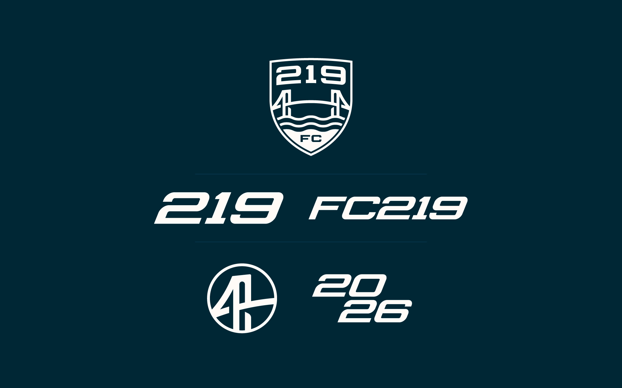
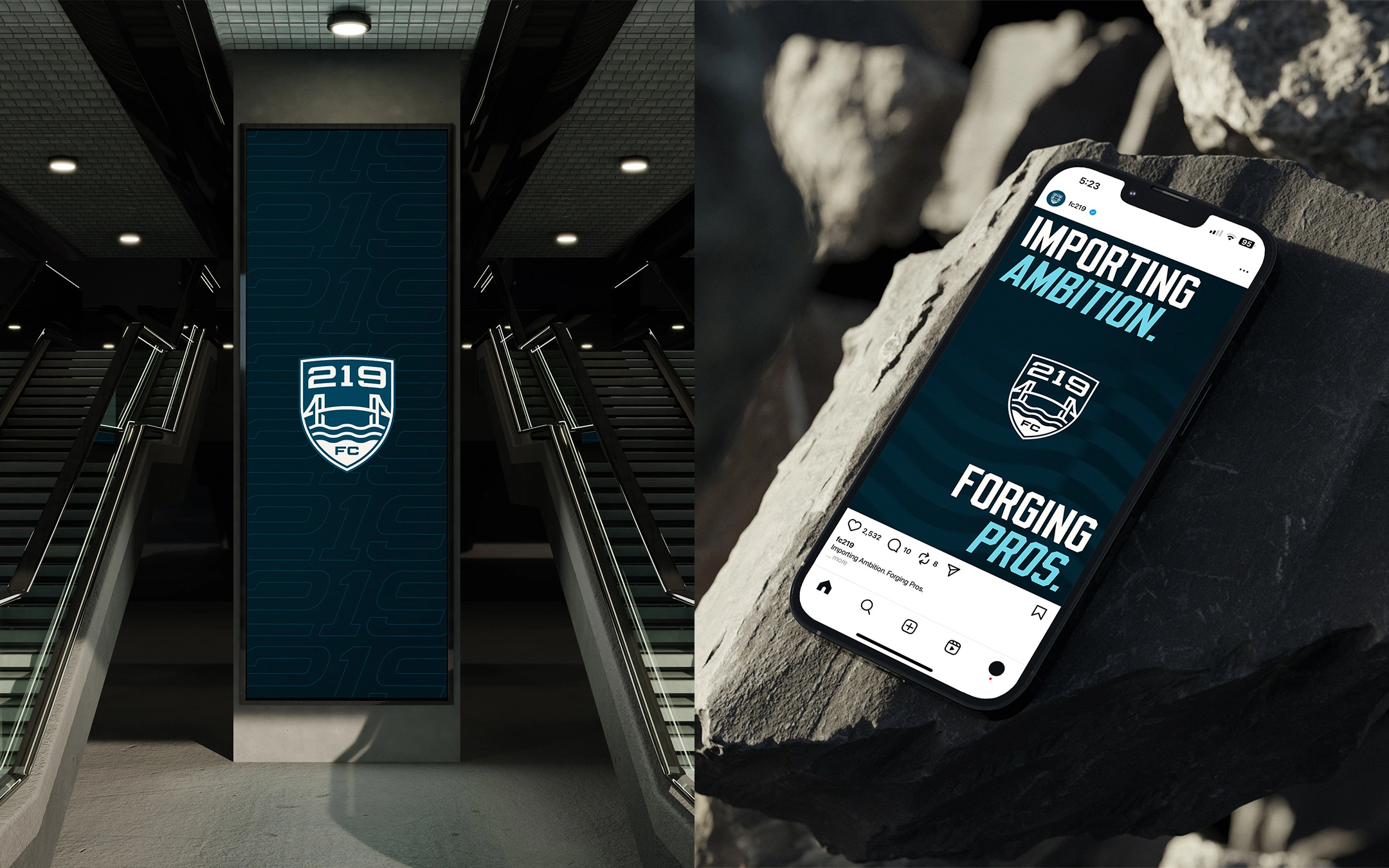
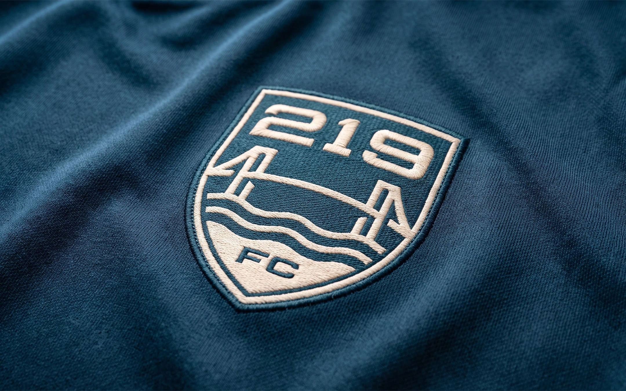
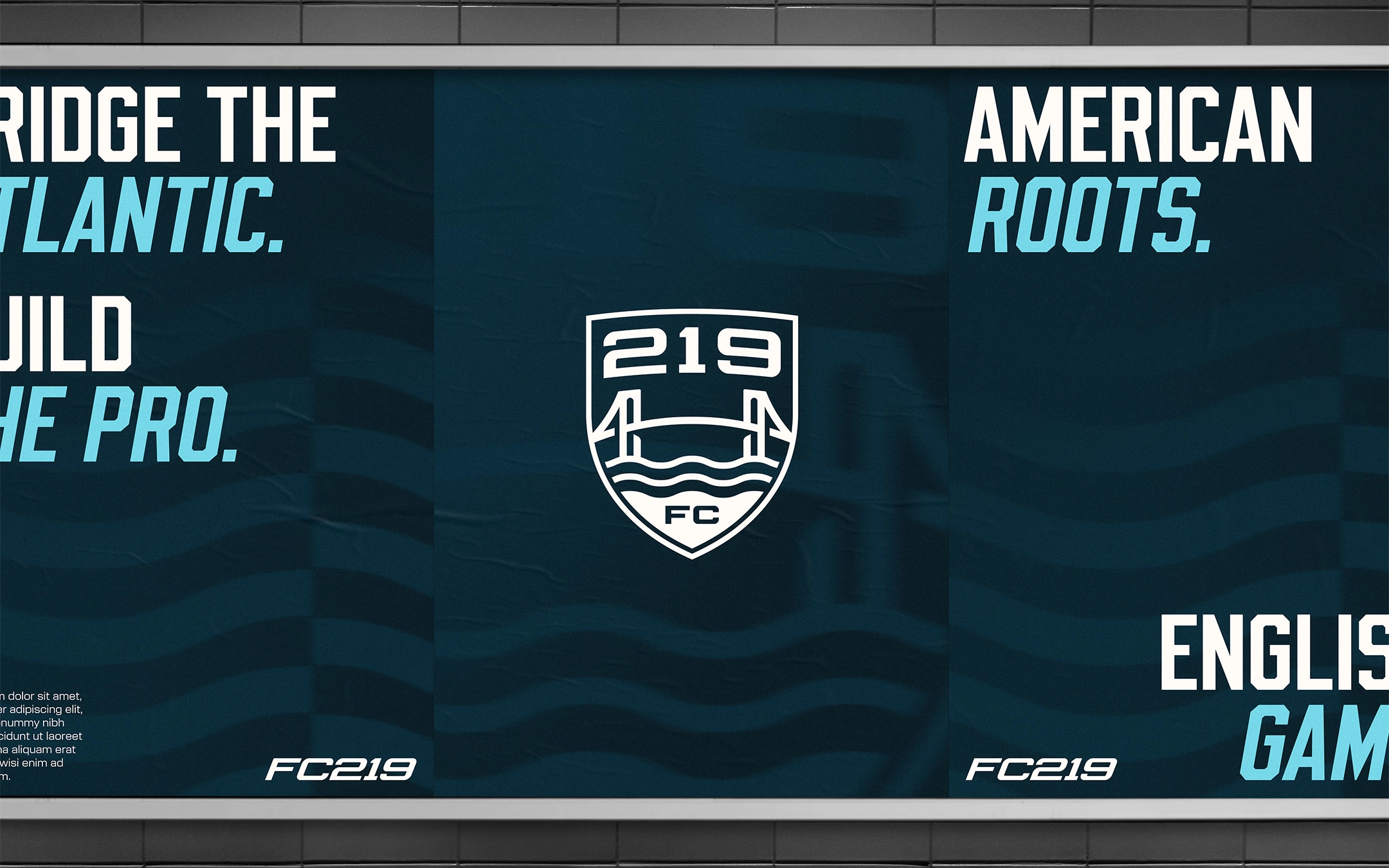
To translate this transatlantic journey visually, the brand identity relies on core symbols that represent connection, journey, and the crossing between the two countries.
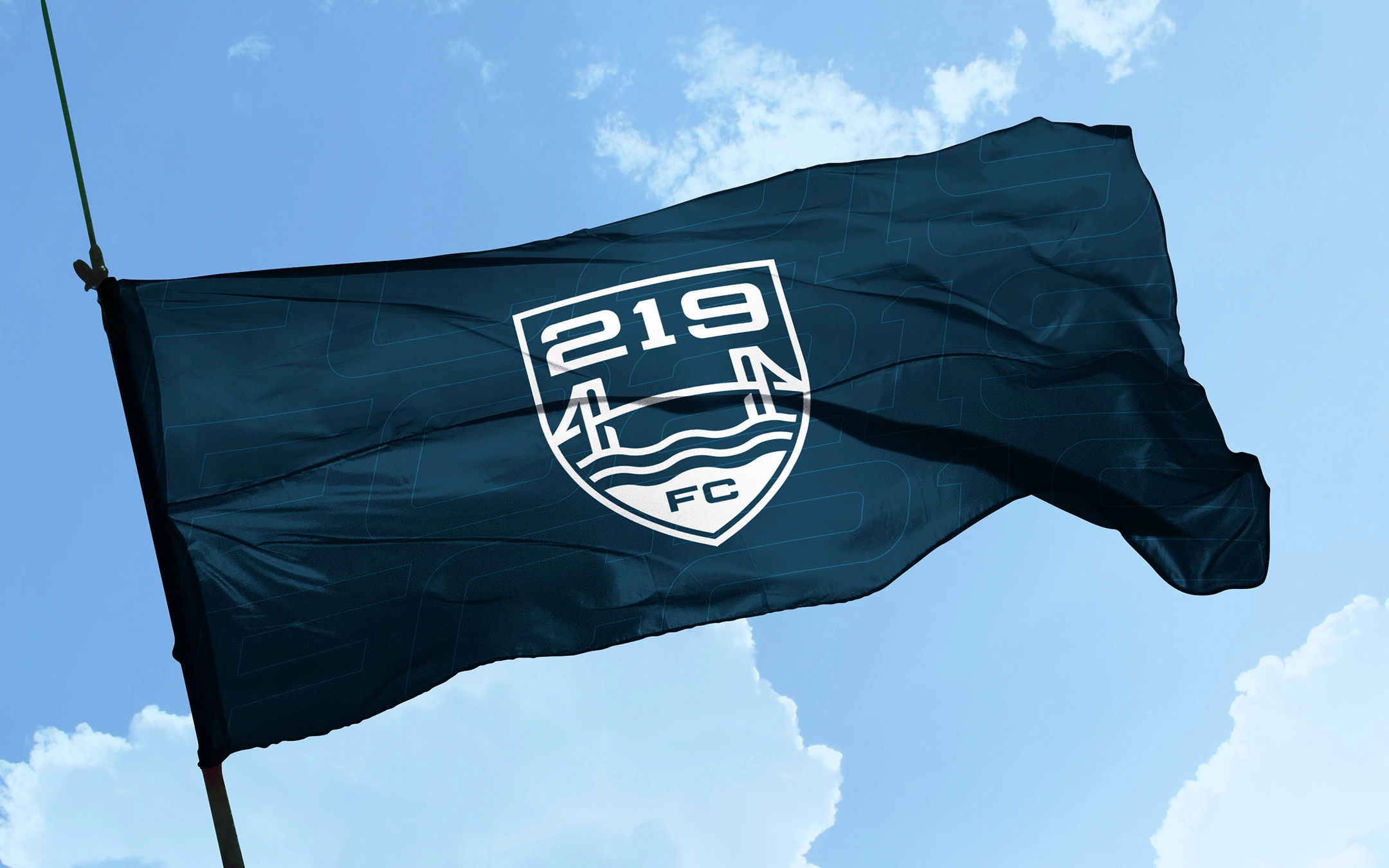
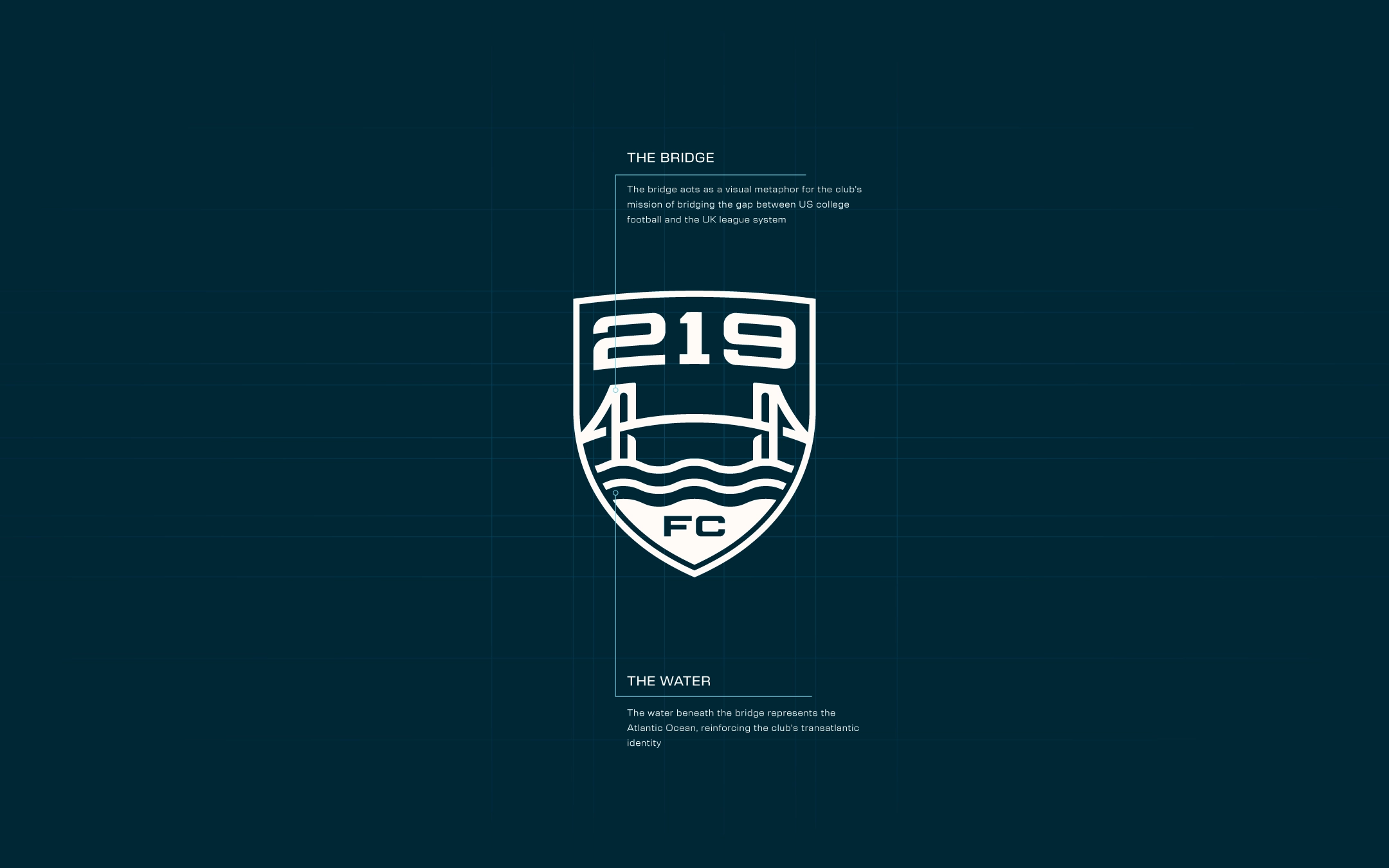
The Bridge: Acts as a visual metaphor for the core mission of bridging the gap between US college soccer and the UK league system, establishing a clear pathway for players to continue athletic development overseas.
The Water: Represents the Atlantic Ocean, reinforcing the transatlantic identity of the club and symbolizing the connection between the United States and the United Kingdom.
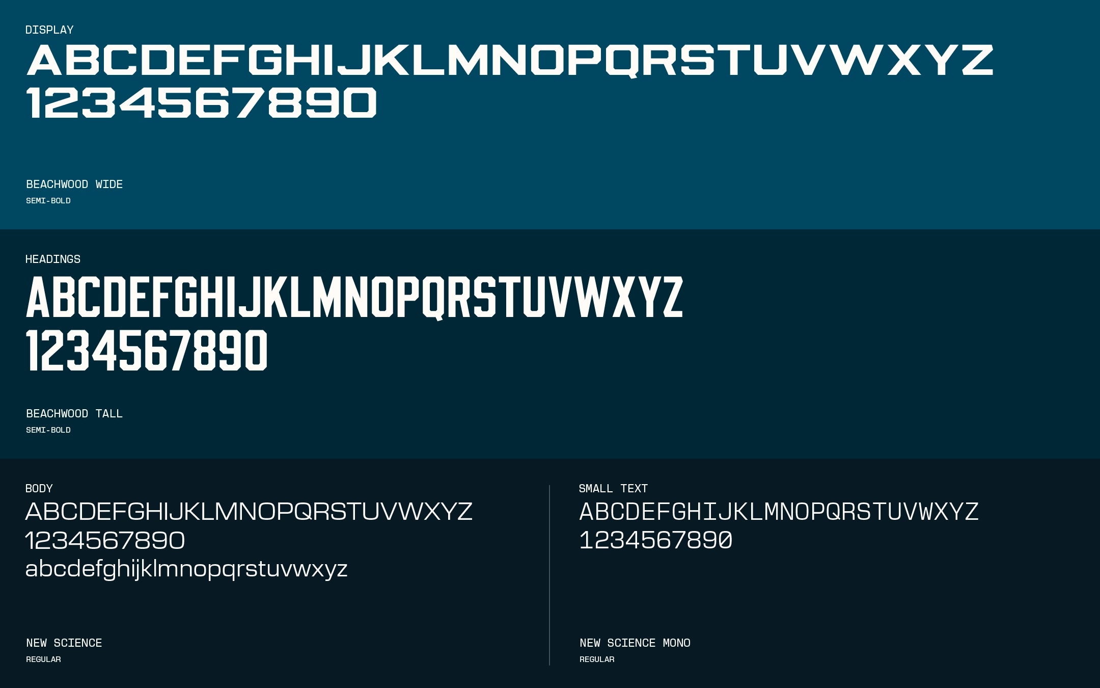
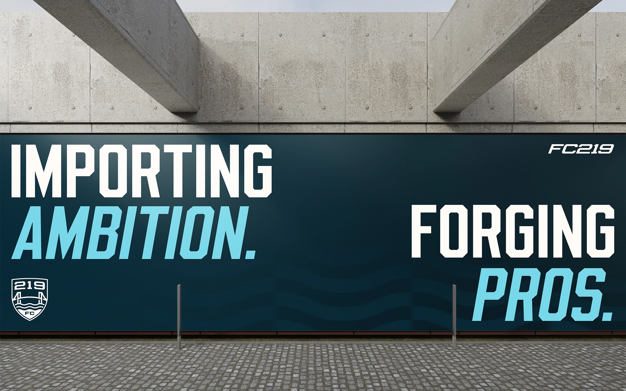
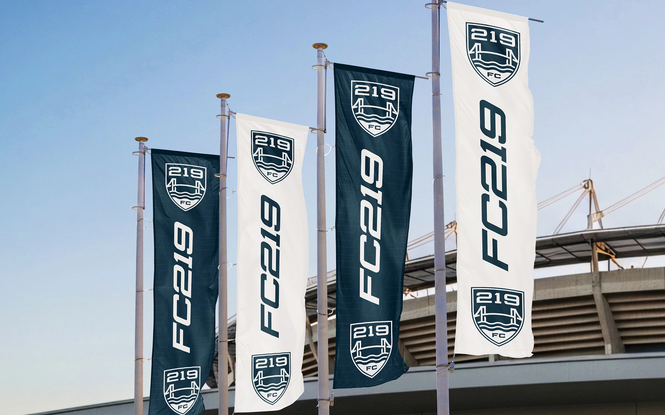
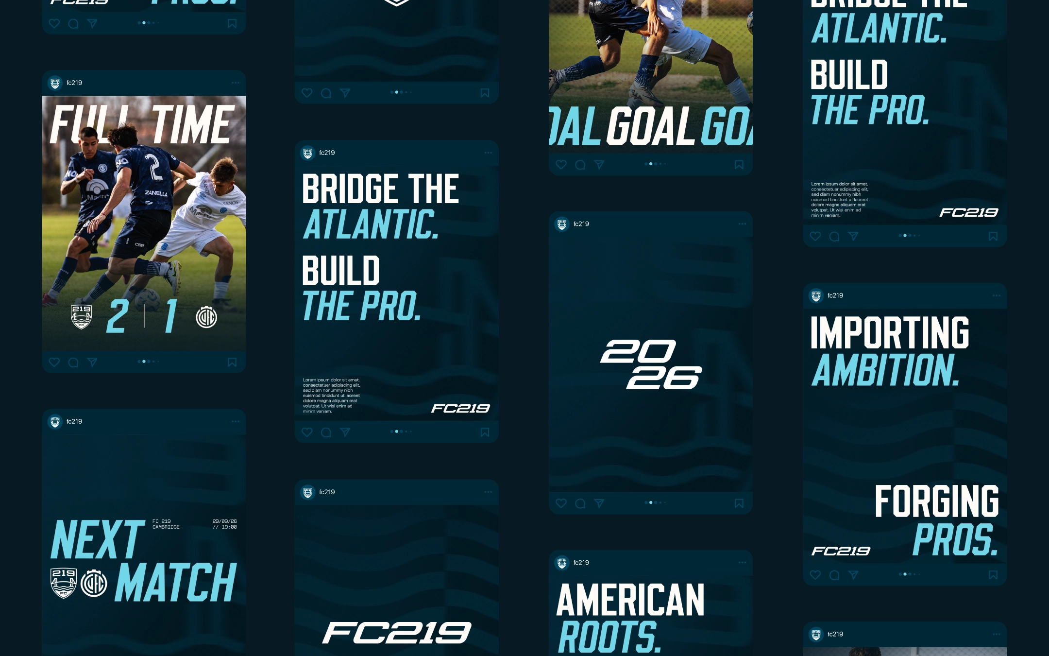
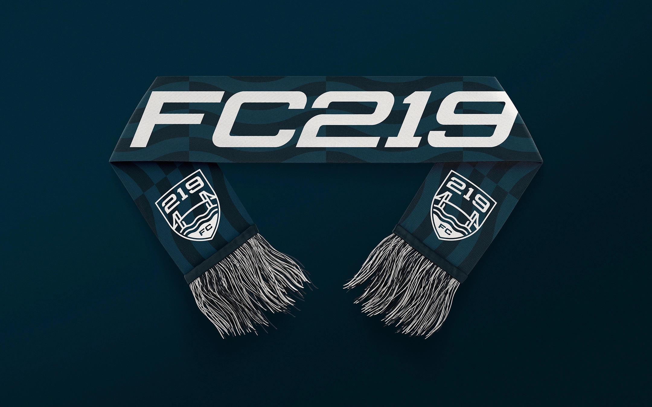
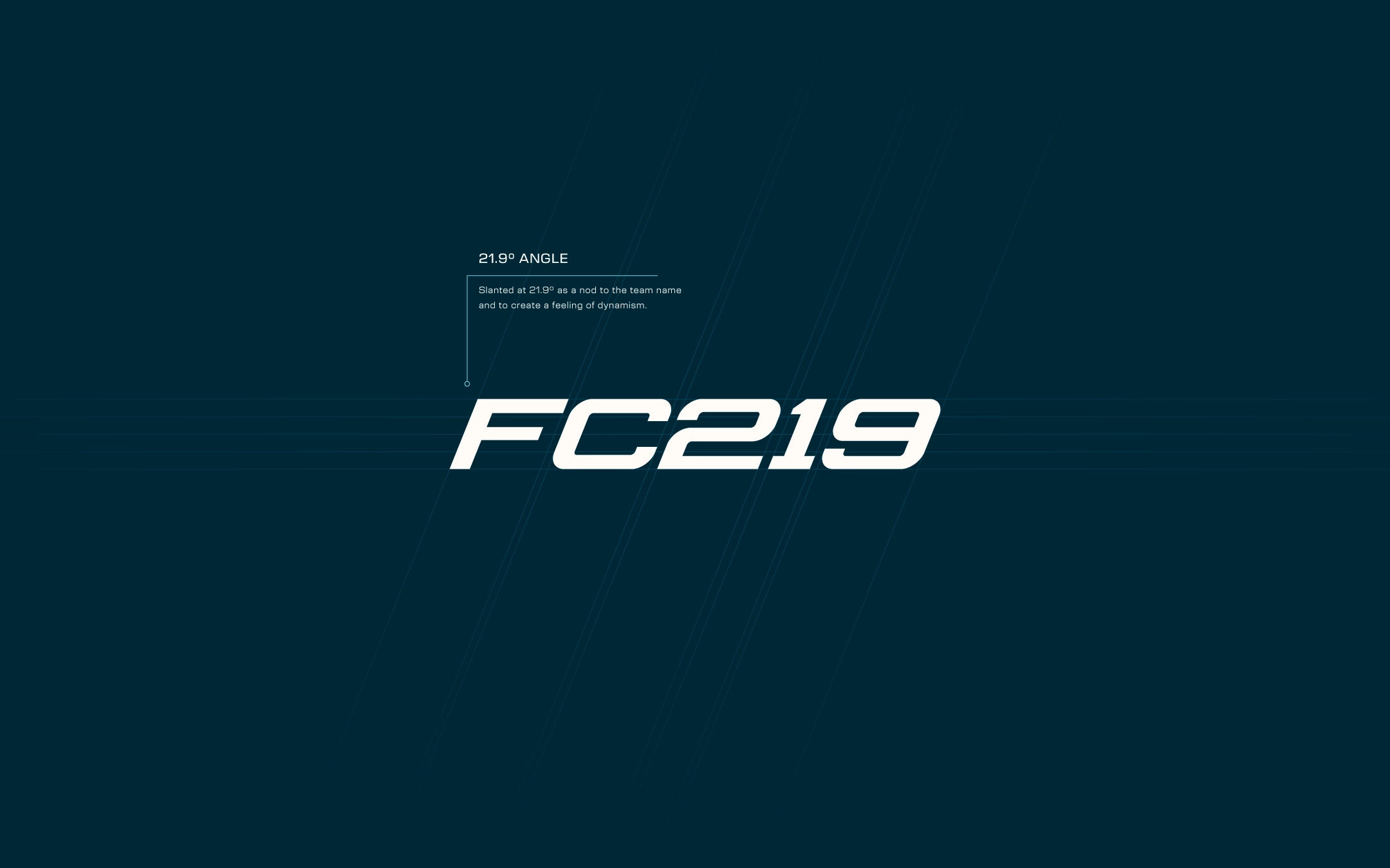
Typography: The wordmarks utilize the same typography of the main badge to ensure brand consistency. To introduce a more energetic and dynamic feel, a slanted version of the wordmark was developed. In a nod to the brand name, this slant is set at 21.9 degrees.
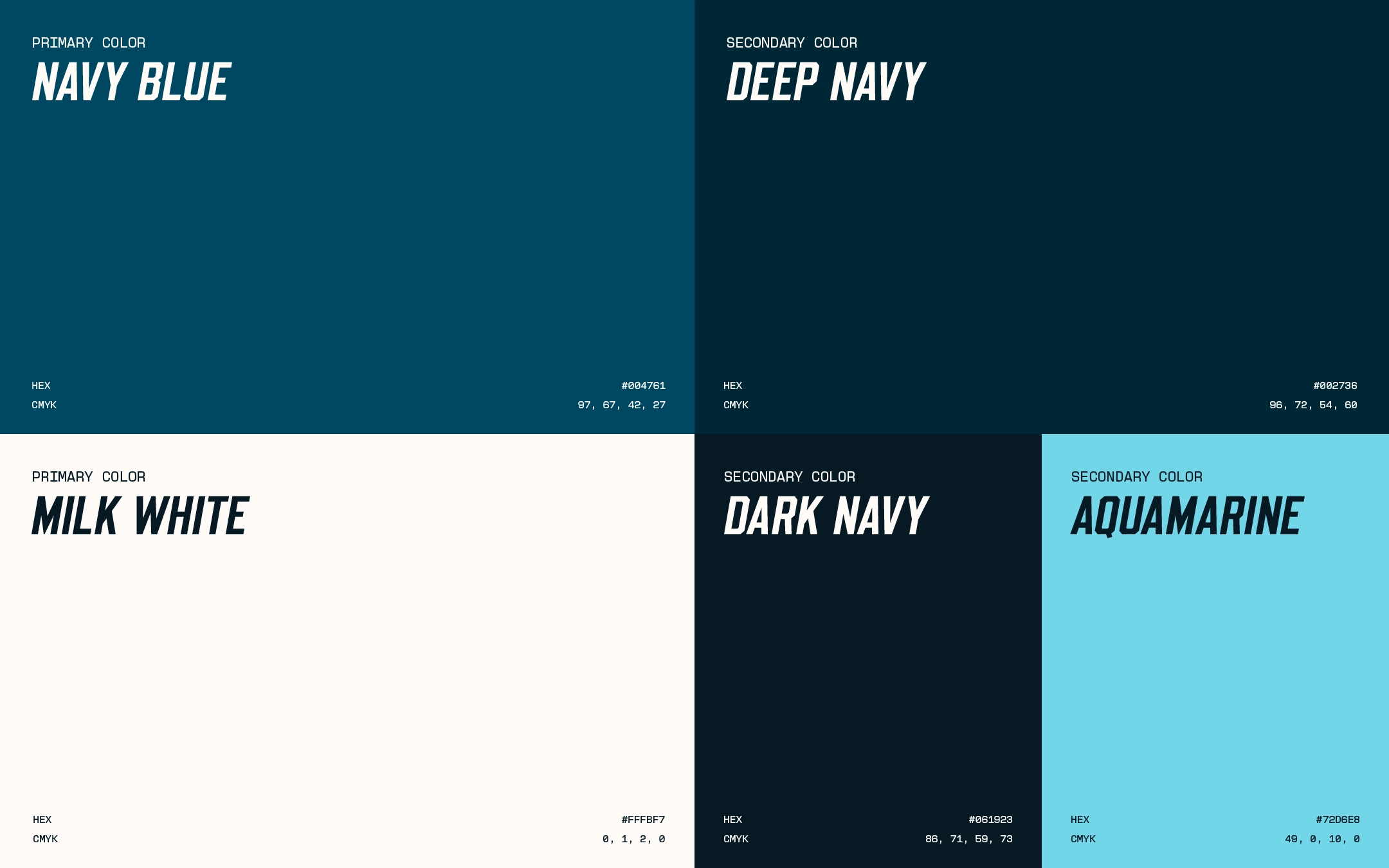
Color
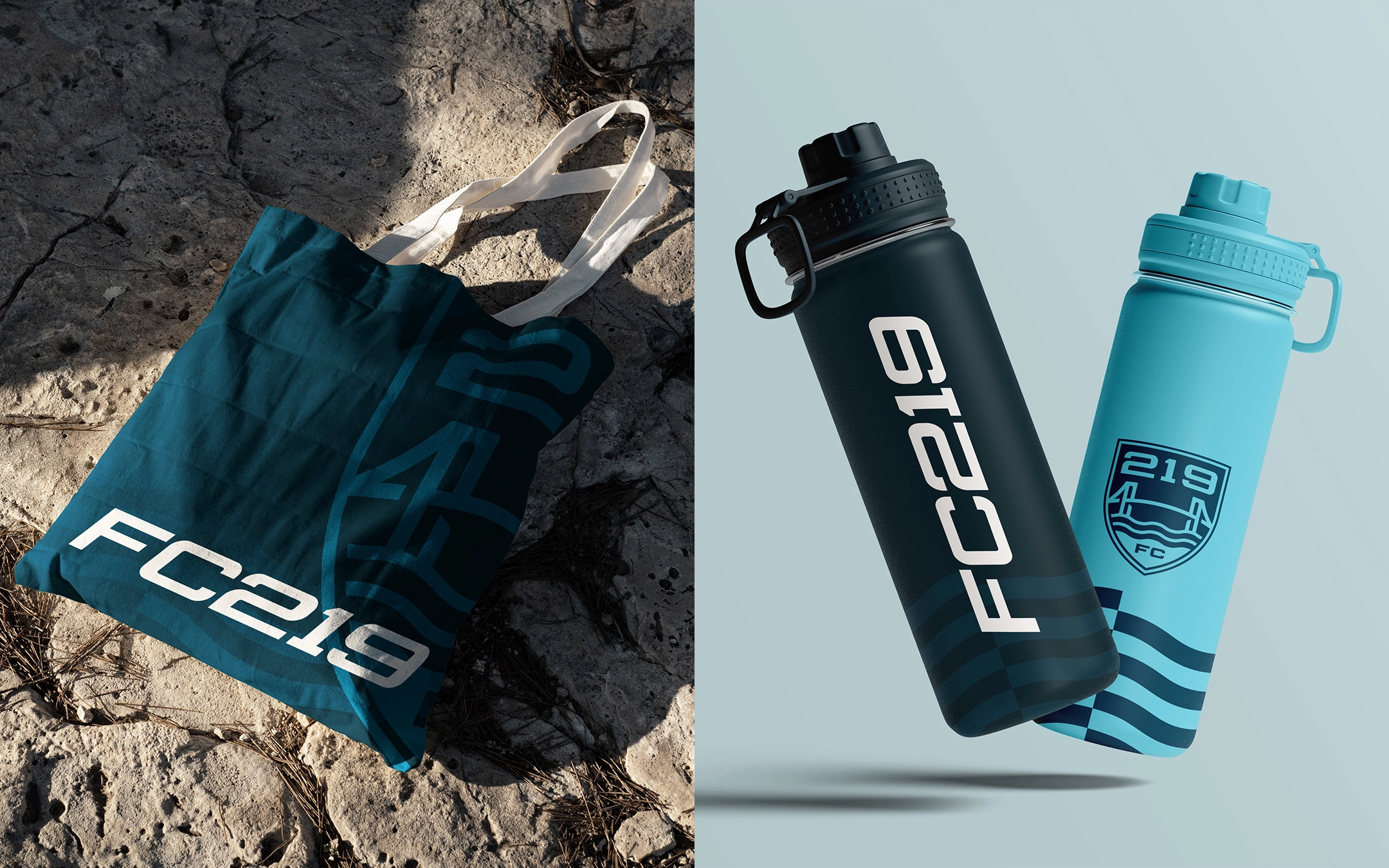
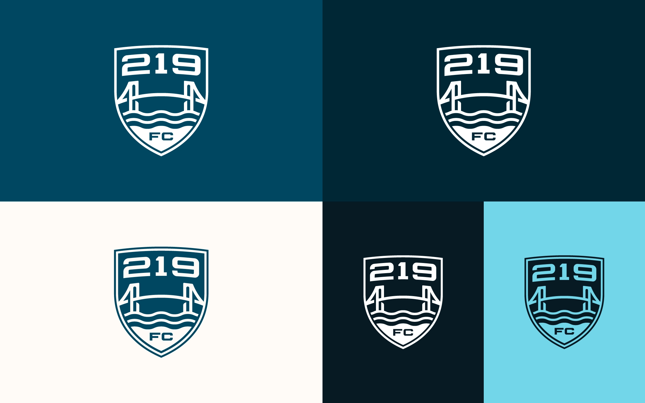
Navy: Serves as the primary colour, reinforcing the theme of the sea and the transatlantic journey. Also linking to the United States and United Kingdom national flags.
White: To contrast against the deeper tones, ensuring sharp legibility and a clean, professional aesthetic across the brand.
Aquamarine: A vibrant accent colour to inject energy into the identity, whilst maintaining the aquatic theme.