Ornat, a garment reserach and development studio based in Germany. They needed a visual identity that expressed the hand-made quality of their garments.


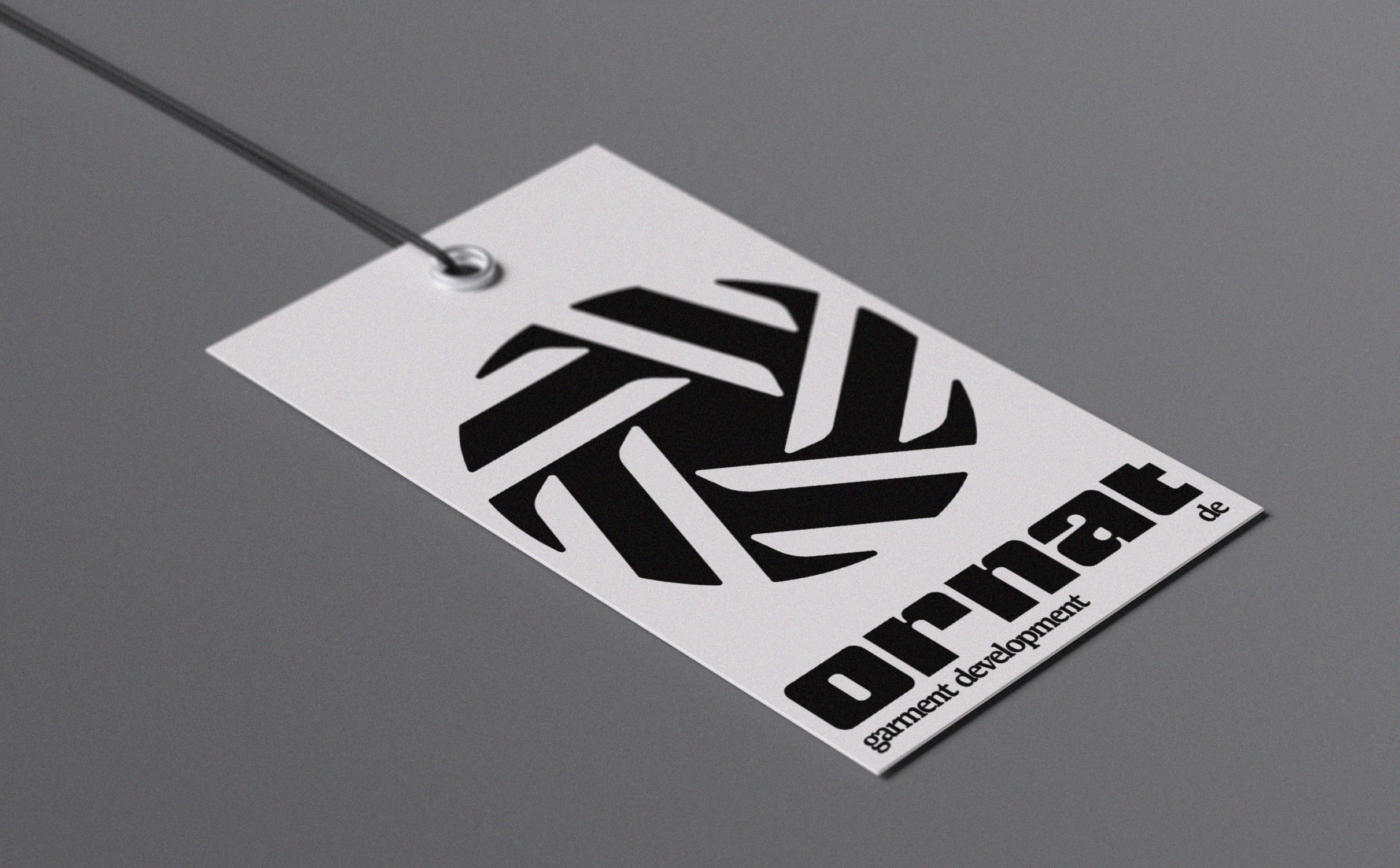
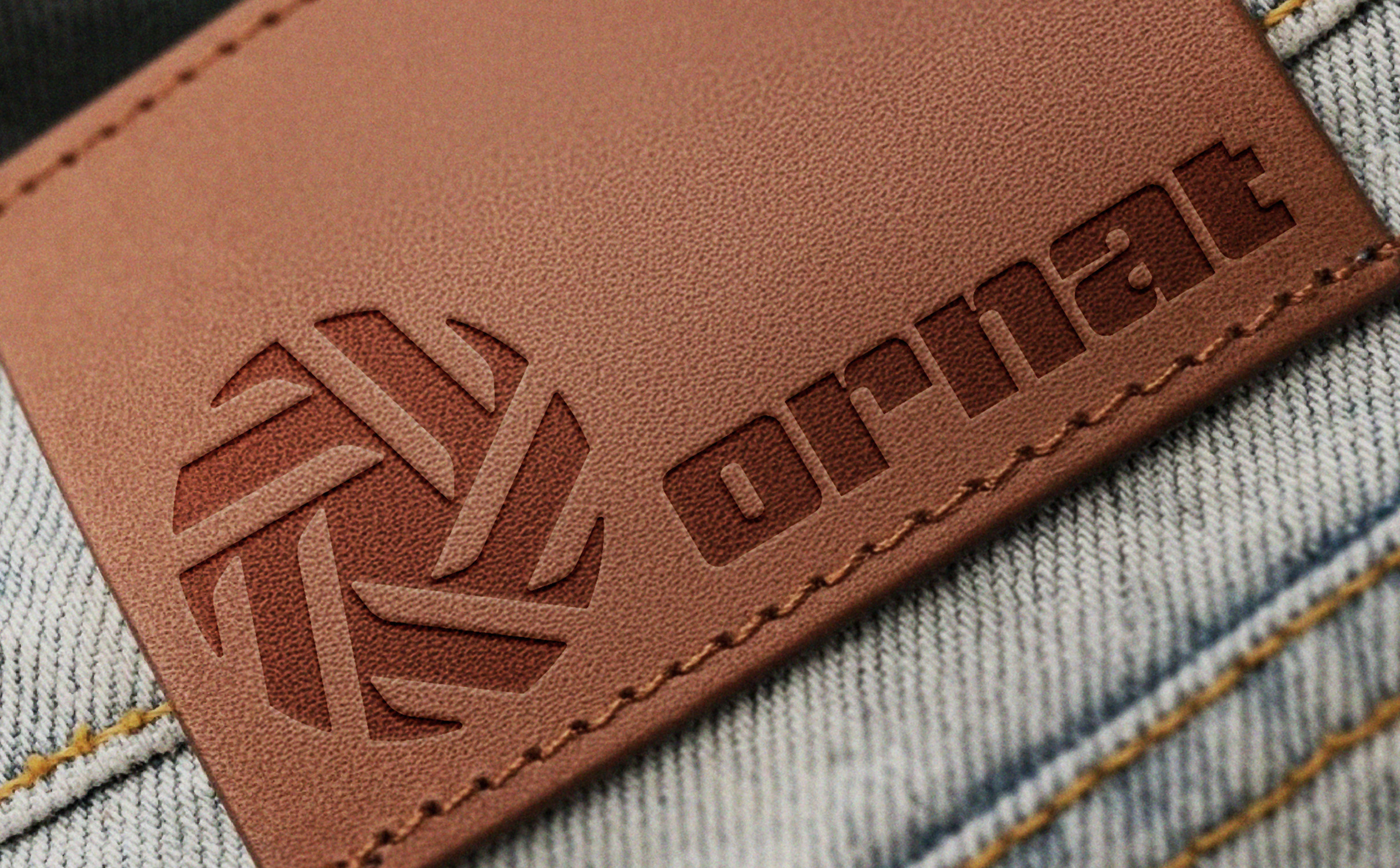
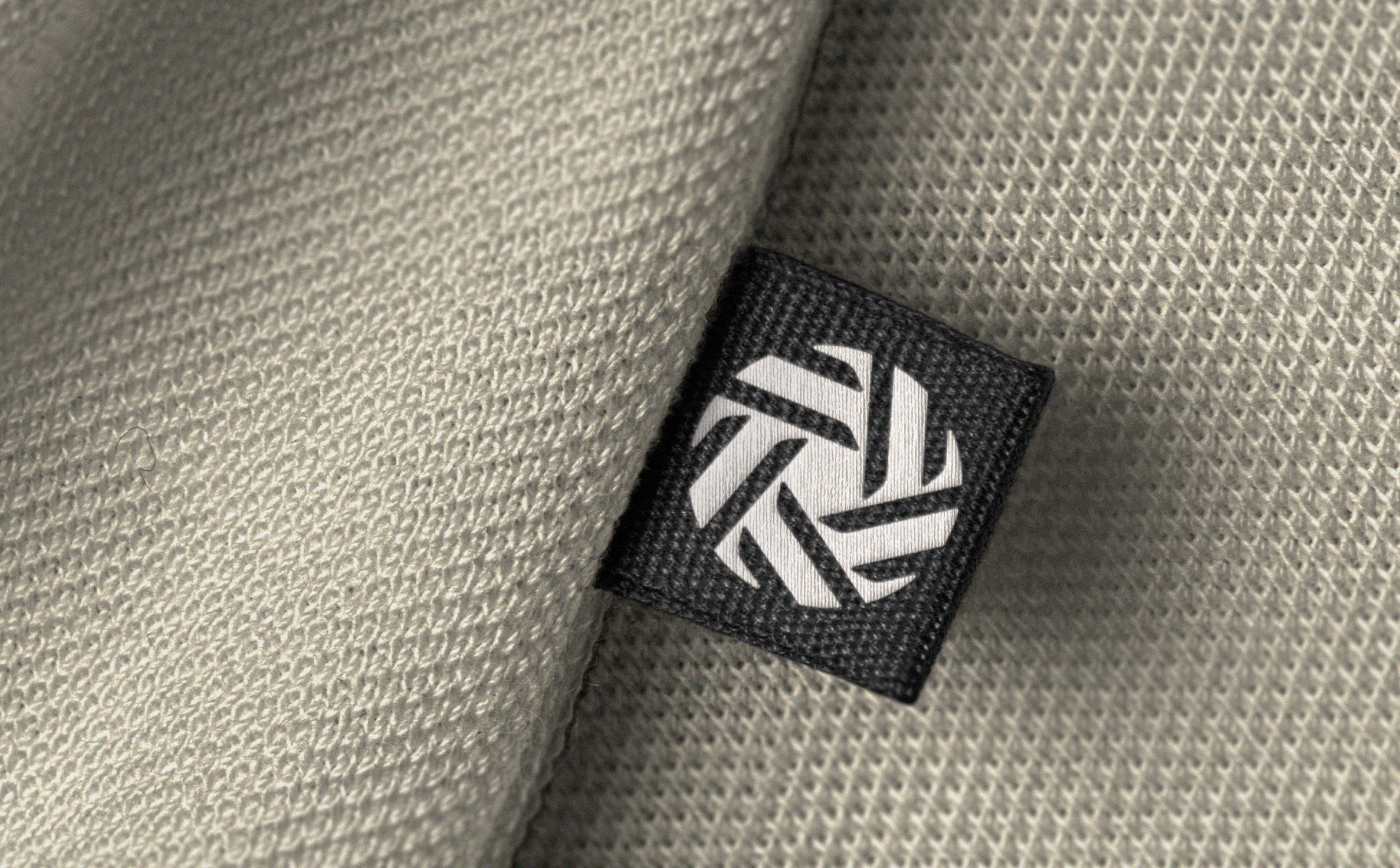
The logo mark is a combination of a thread spool, fabric weave and a diamond cut. The thread spool and fabric weave link to the brands garment creation process and the diamond cut shows the quality that the brand brings with each creation.
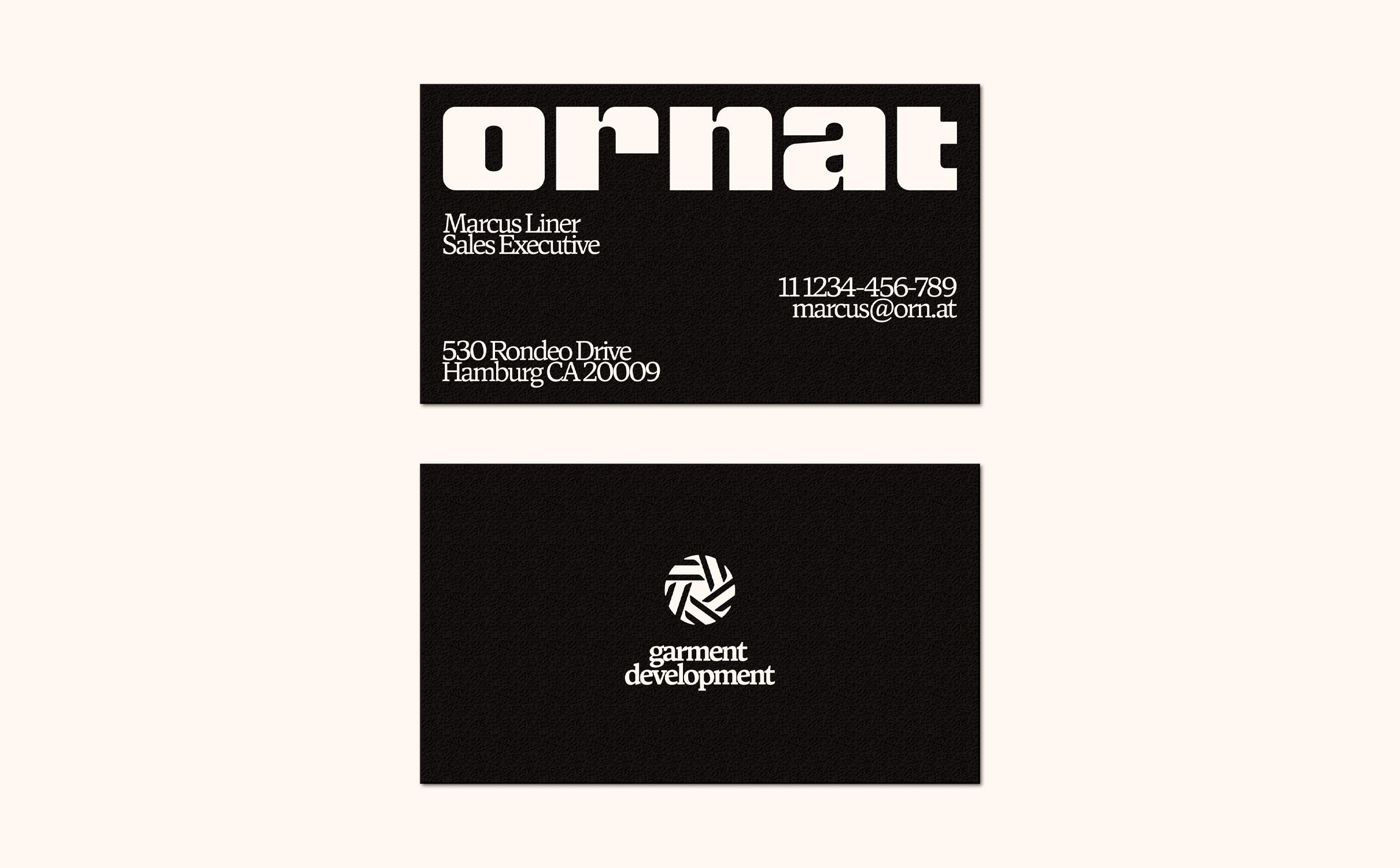
We only chose a subtly warm black and white for the colours to not distract from the garments. It was important that the only colour would come from the clothing so it that it was seen as the most important part of the brand.
The wordmark is a customised version of Nickel Gothic that complements the logomark nicely with the same rounded inner corners. The chunky text gives a feeling of quality and ruggedness to the branding, just like the Ornat garments.
For the rest of the typography we chose a typewriter font for the body that gave the brand a handmade touch and an accent font of Antonia that works great in combination.