Harburg Group is an international investment group with a focus on sports. They asked me to refresh their existing logo and to create a new visual identity that was flexible enough to use on many assets like investment pitch decks, stationery and their website. They wanted the identity to have a balance of corporate aesthetic with a hint of sportiness. Corporate enough to be taken seriously by major investors but also sporty enough to appeal to club fans.

Firstly I identified the main issues with the old logo:
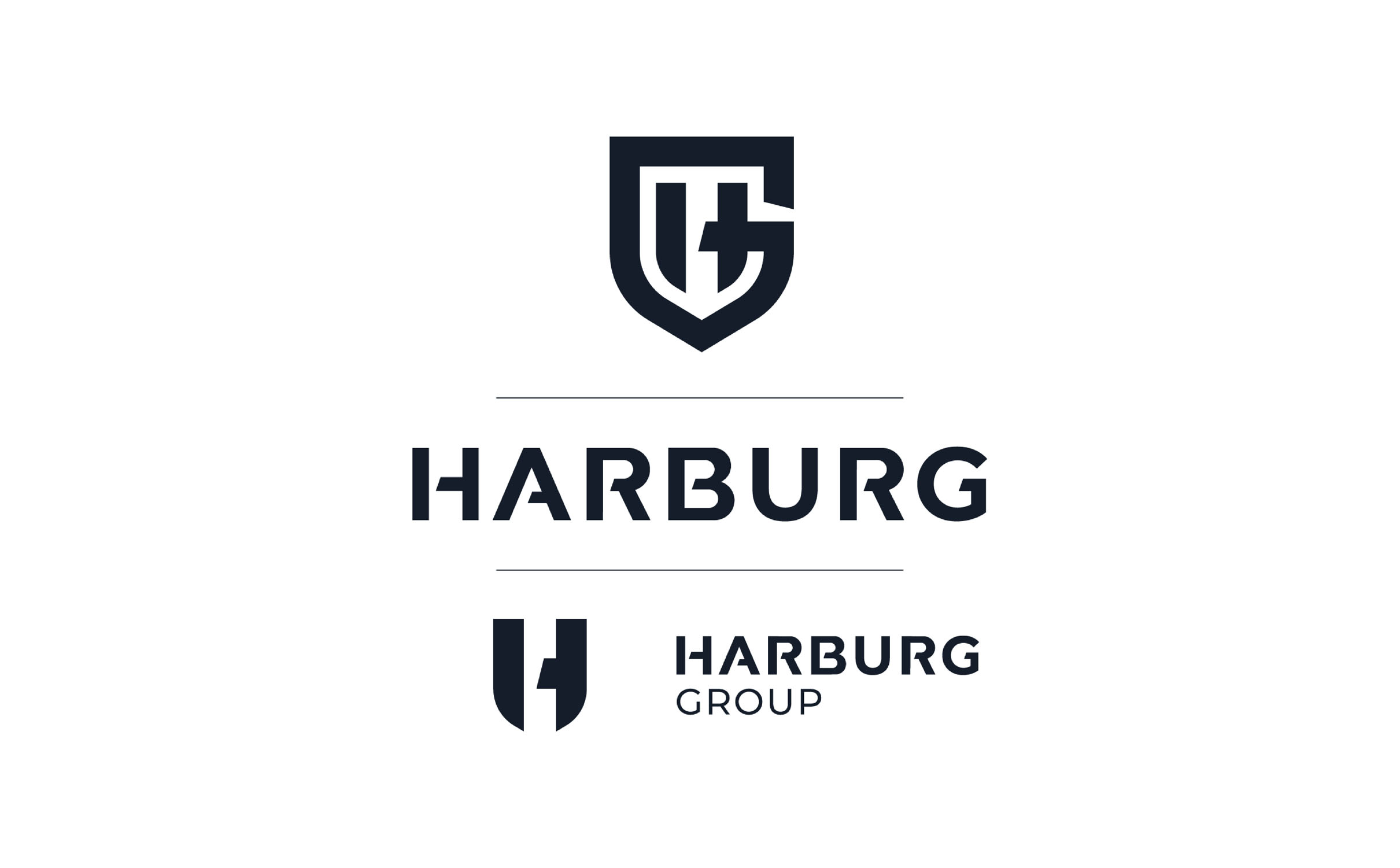
I then corrected these issues by redesigning the mark to a more reductive design that has less conflicting angles and sharp points and is more legible.
Used the cut-out angle from the cross section of the ‘H’ again for the wordmark to create a more unique feeling that also connects to the icon.


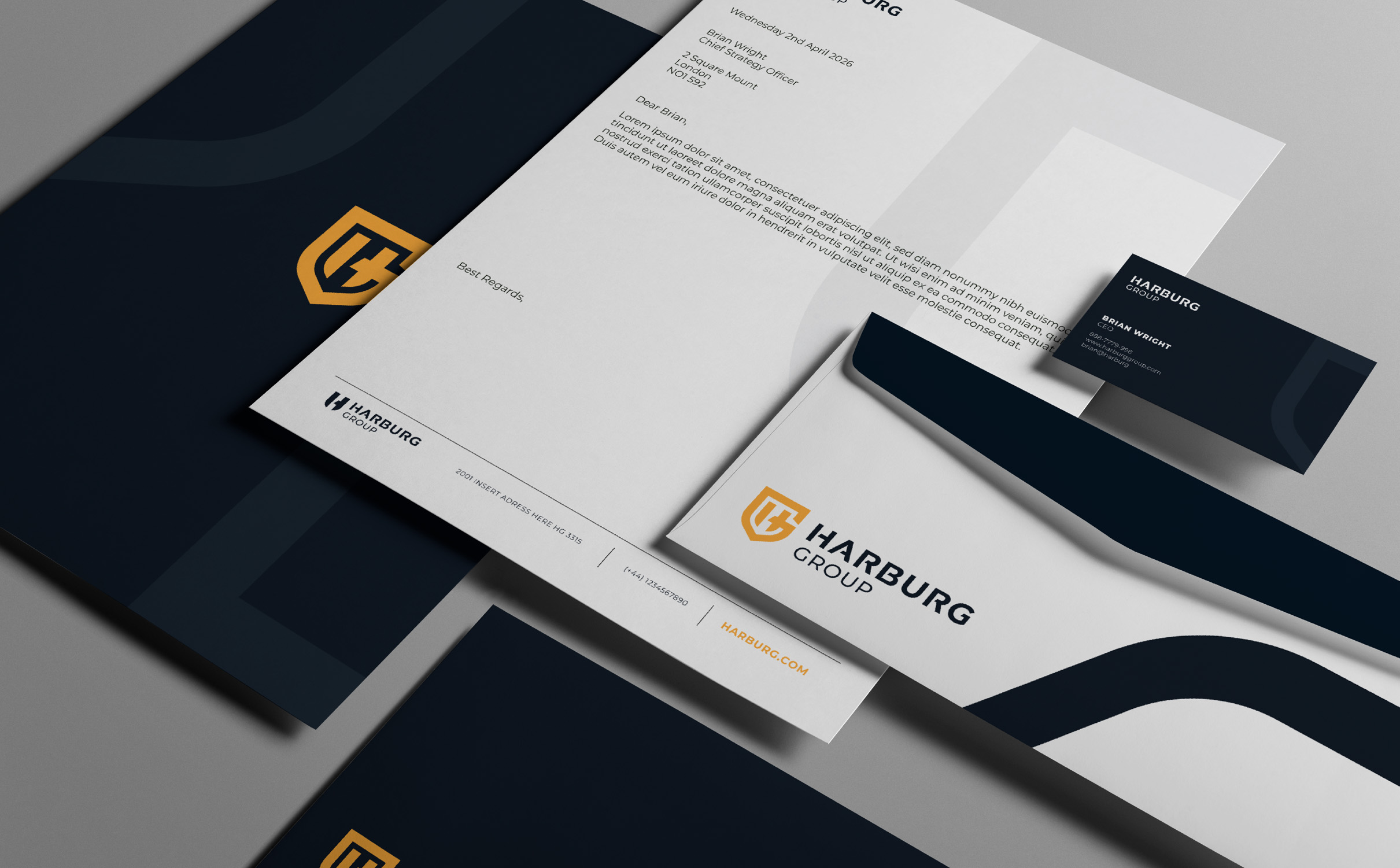
We then expanded and built the whole identity around the shield shape from the logo to ensure a cohesive design style throughout the branding.
Gold navy and white were chosen as the main colours to add a sense of trust and class to the branding.
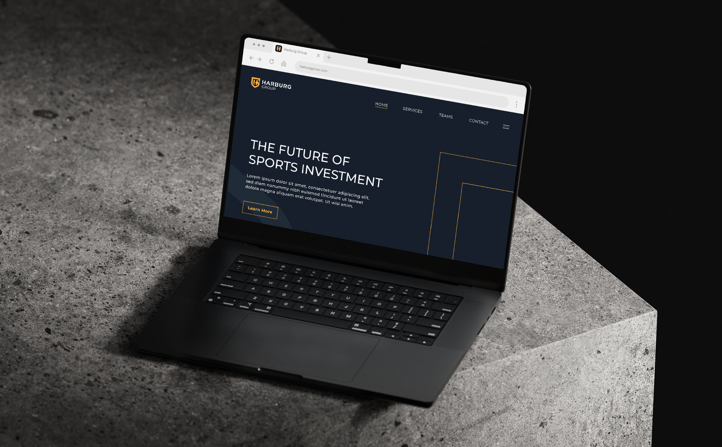
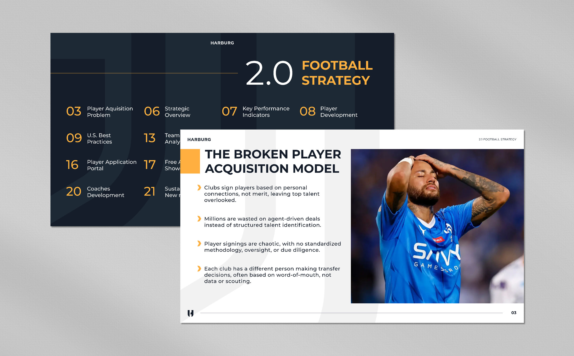
Putting the new identity to the test, I was asked to create pitch deck templates, stationery, a website design and logos for the subsidiary companies within Harburg Group.