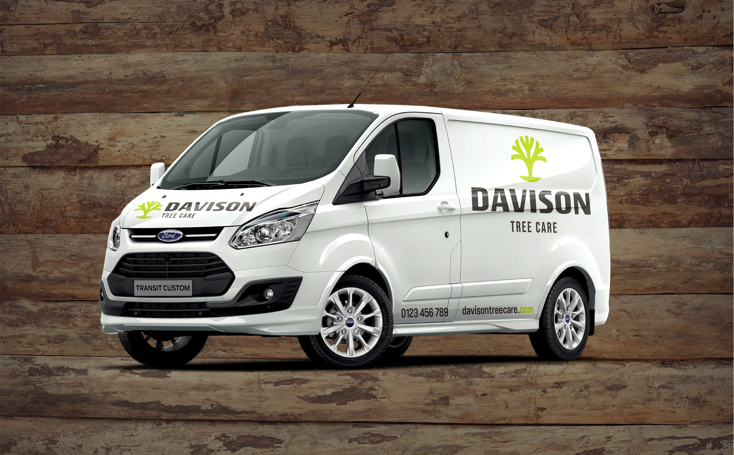
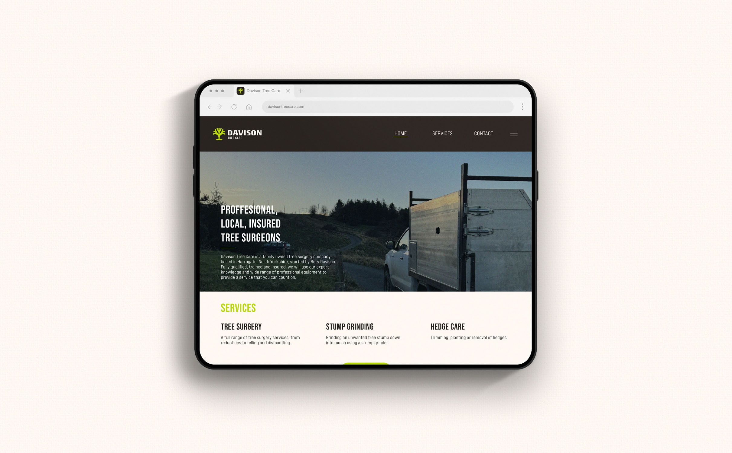
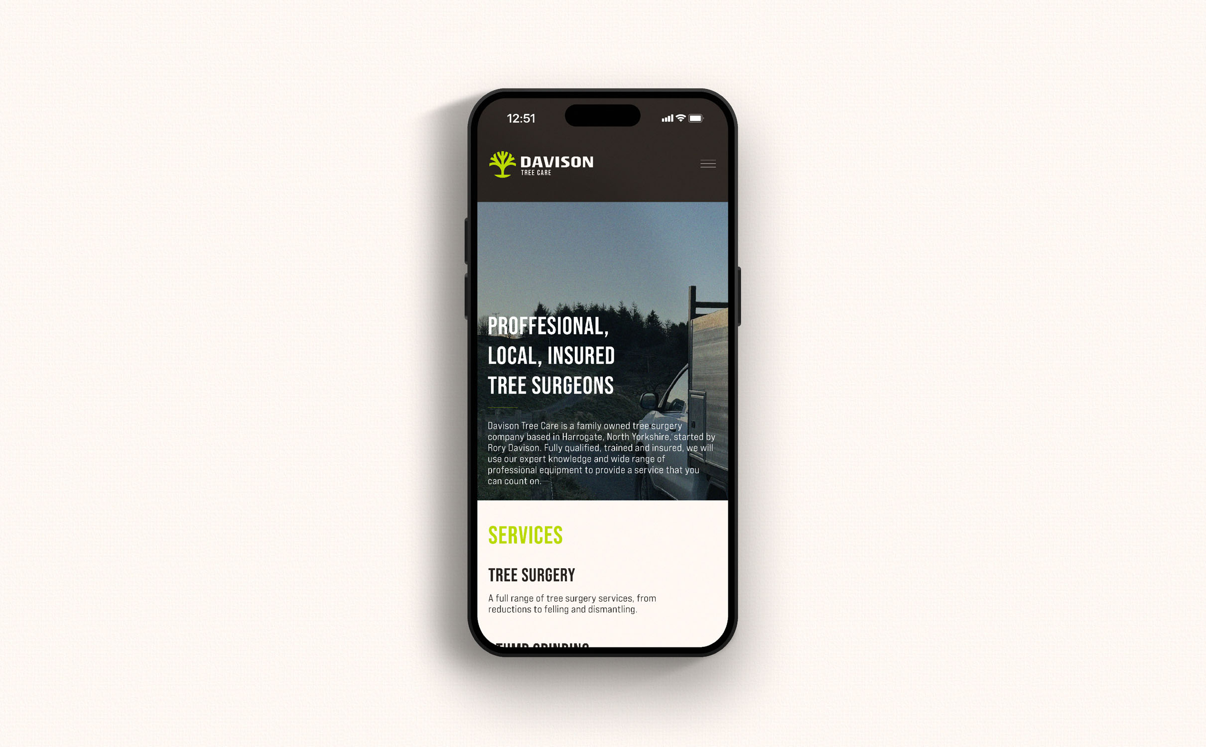
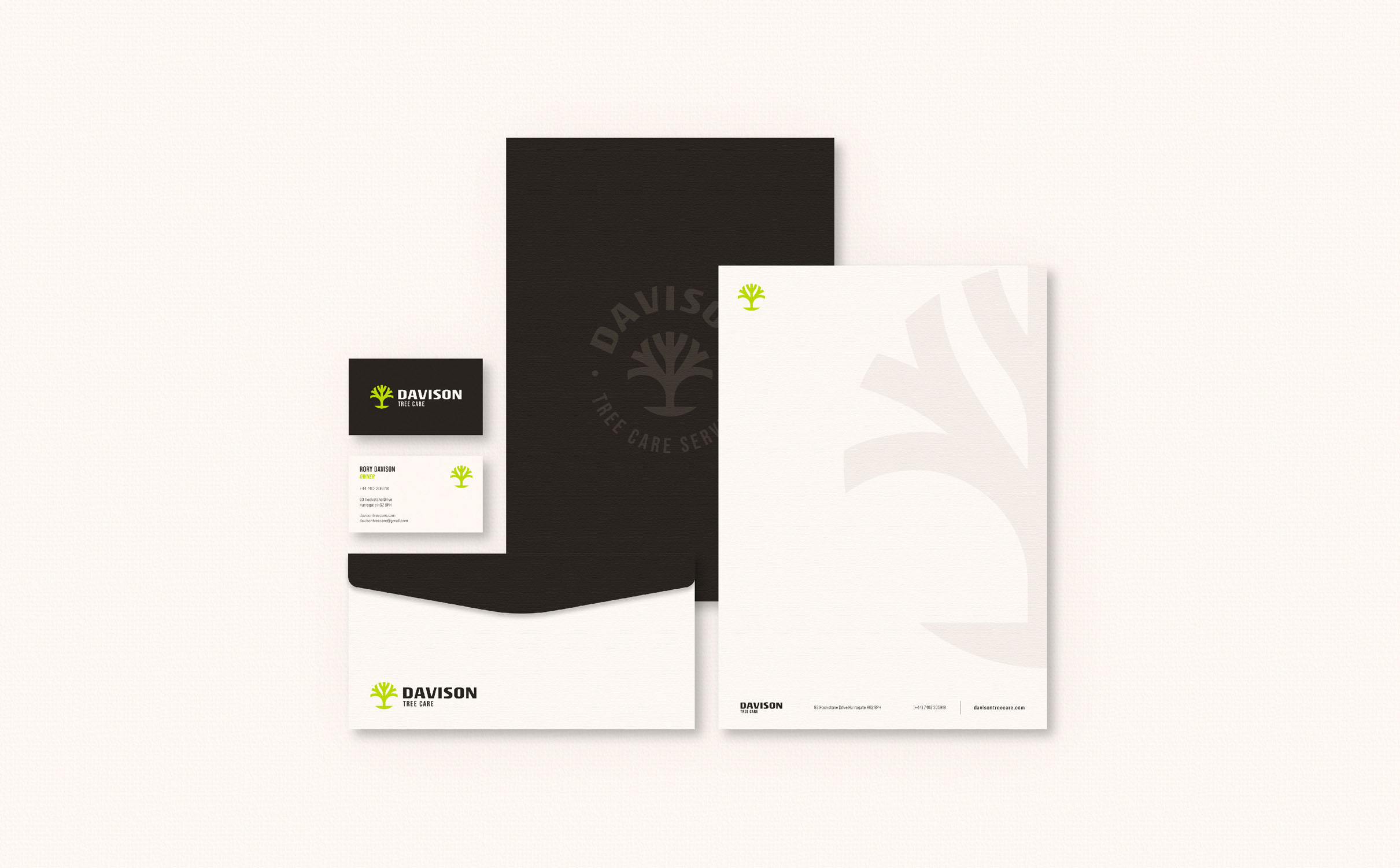
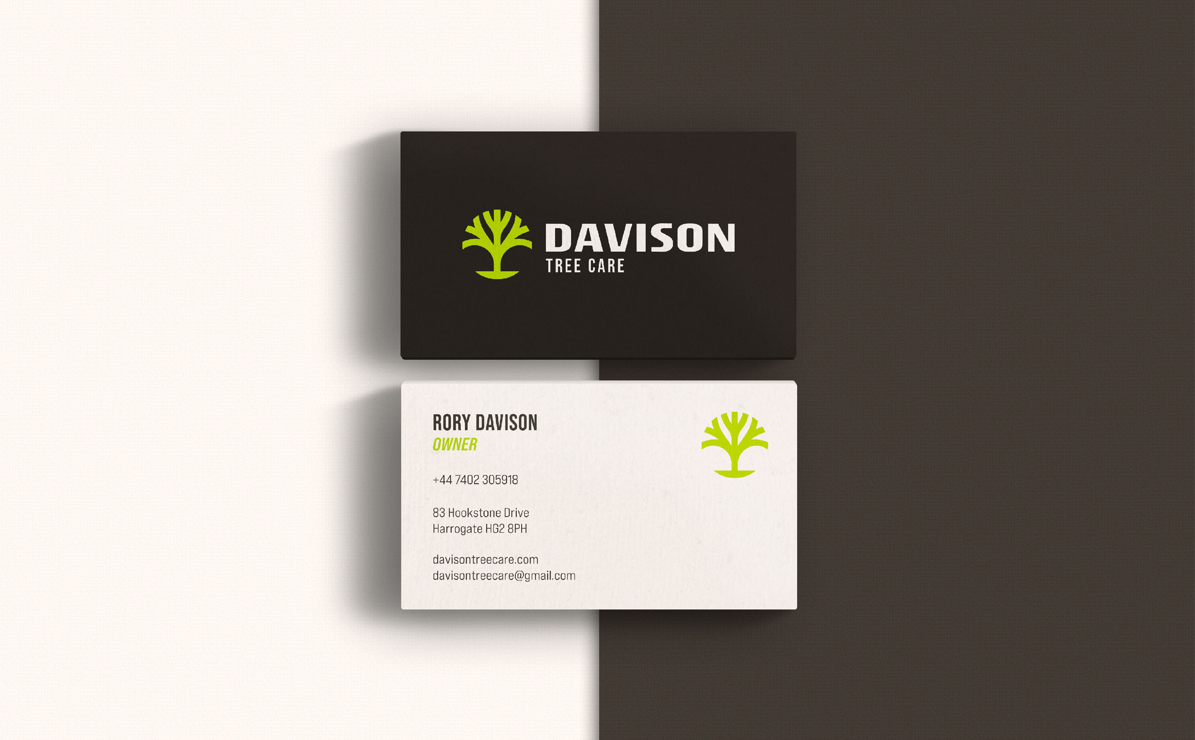
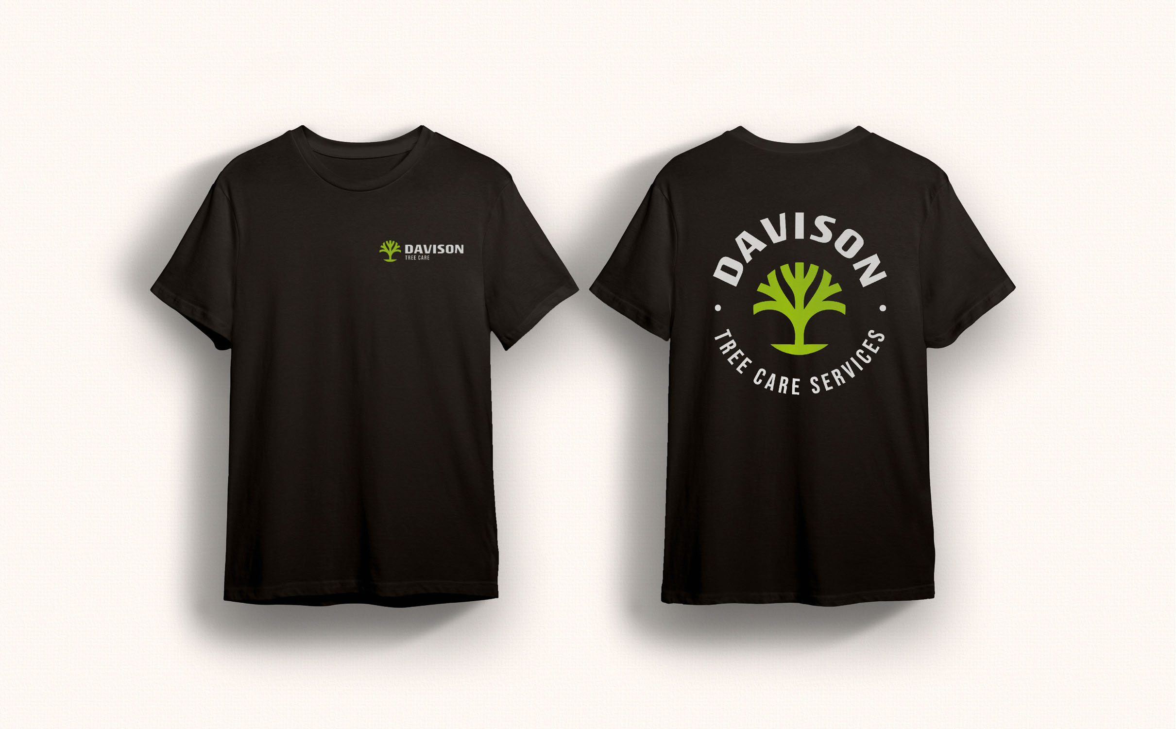
Rory came to me with the intention of launching his new tree care business. He asked me if I could design a visual identity for his new brand, Davison Tree Care. After discussing the brand goals and his objectives I understood he wanted a simple logo that expresses nature, functionality and professionalism, along with a visual identity, stationery and website design


The Primary mark is a simple geometric tree and suits the brand perfectly, it’s simple, practical and instantly shows what the brand is all about. The design of the tree also looks a like a cross, crosses are synonymous with aid and care, another link to the tree care provided by the company.
We chose Rogue Sans Extended for the accompanying text, but I simplified it slightly by straightening and smoothing the edges of some of the letters. The wordmark is strong, solid and shows the company’s professionalism and practicality. It also pairs well with the simple logomark.